The Original Design
The original design of Tombow’s marker sell sheets (shown below) offered a generic outline of product availability, but the layouts lacked a sense of value proposition. Designs included photos of product packaging along with a list of product SKUs and descriptions, but there wasn’t a call to action for buyers, or even a price, leaving potential buyers with a lot of unanswered questions when it came time to make a purchasing decision.
The Original Design
The Goal
My goal in the redesign was to turn this sell sheet into a full-fledged marker catalog that is all encompassing. I wanted this resource to not only inform customers about Tombow markers, but I wanted it to also tell Tombow’s unique brand story so that we could answer the questions “Why should we buy these products? What makes them different? What are these products used for and what makes them useful?”
The Redesign
In order to answer those questions, I wanted to incorporate the following information:
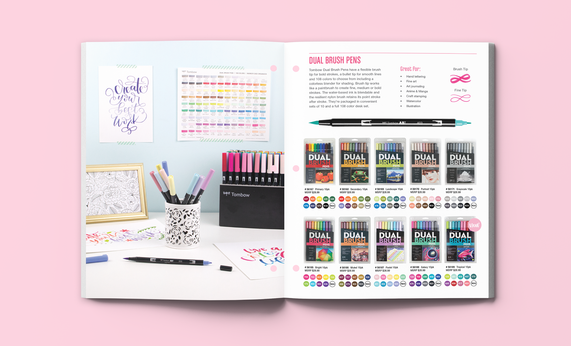
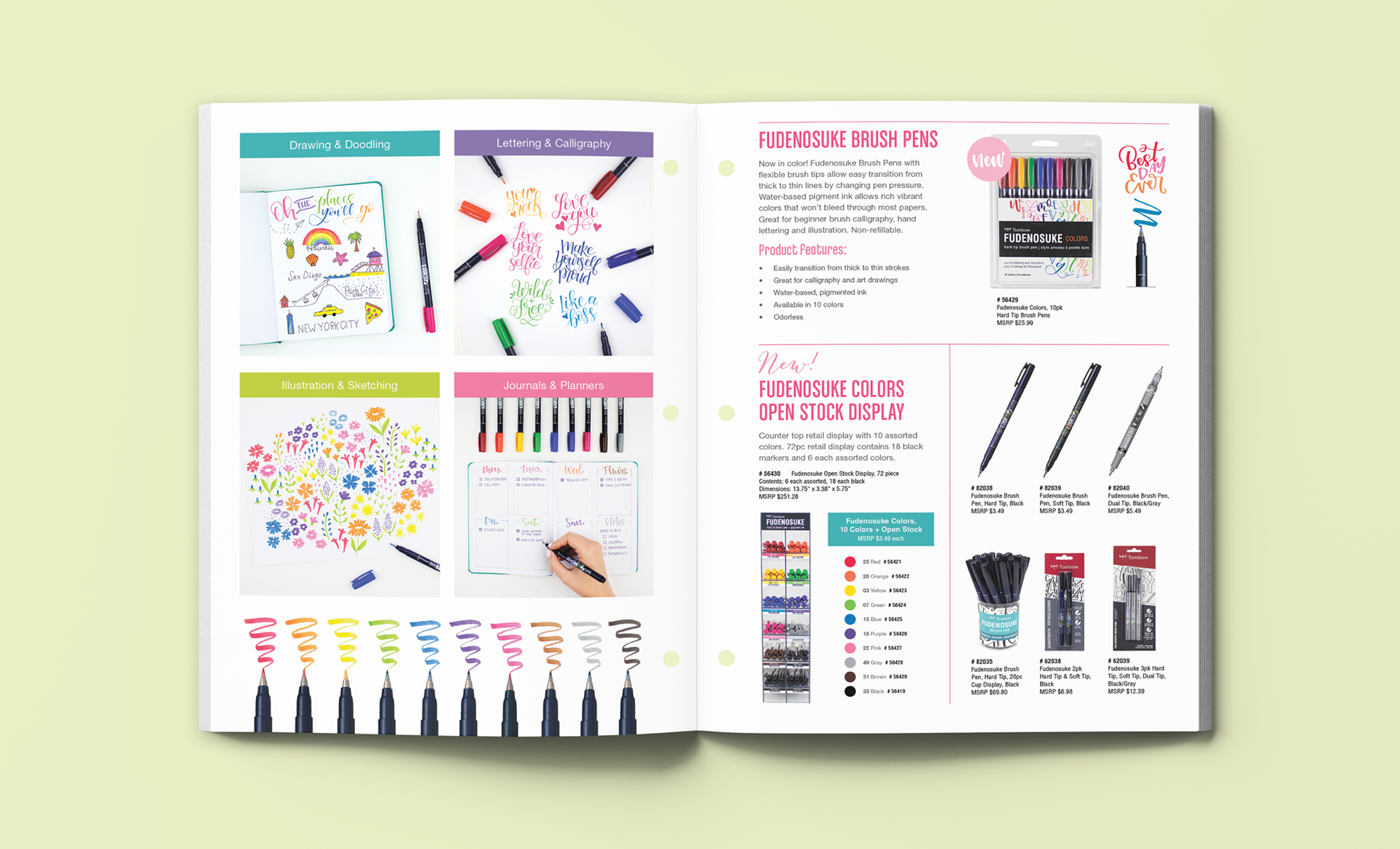
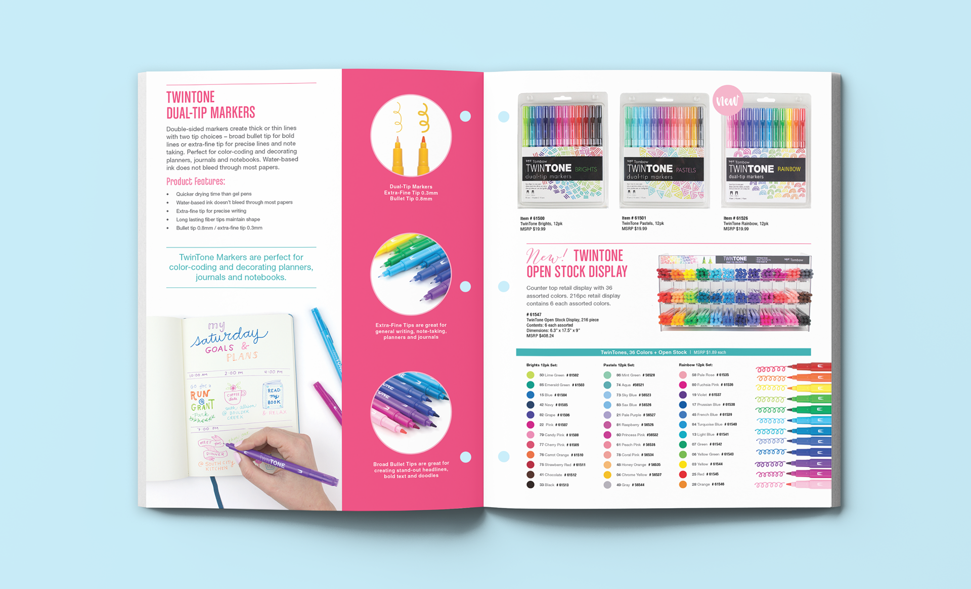
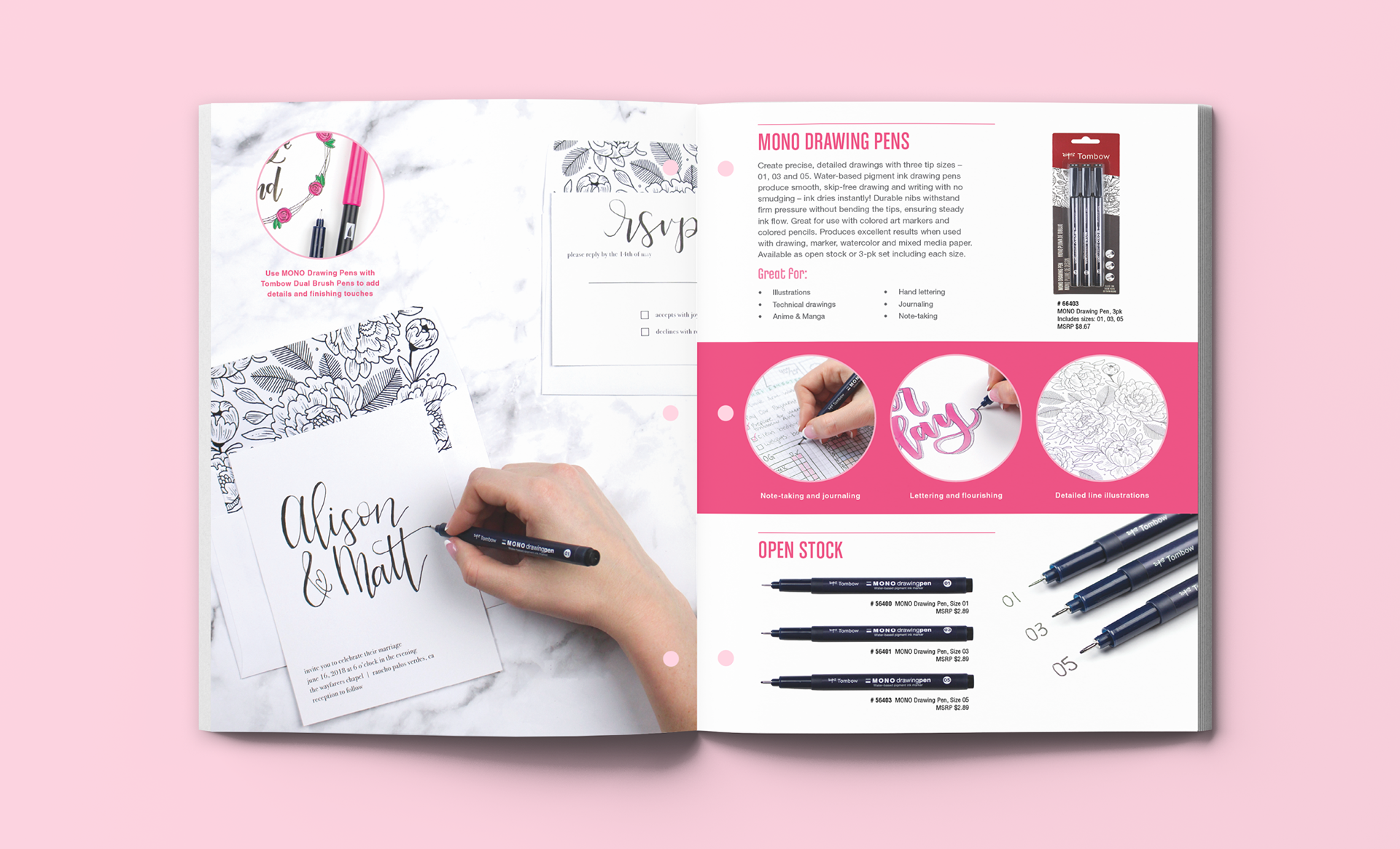
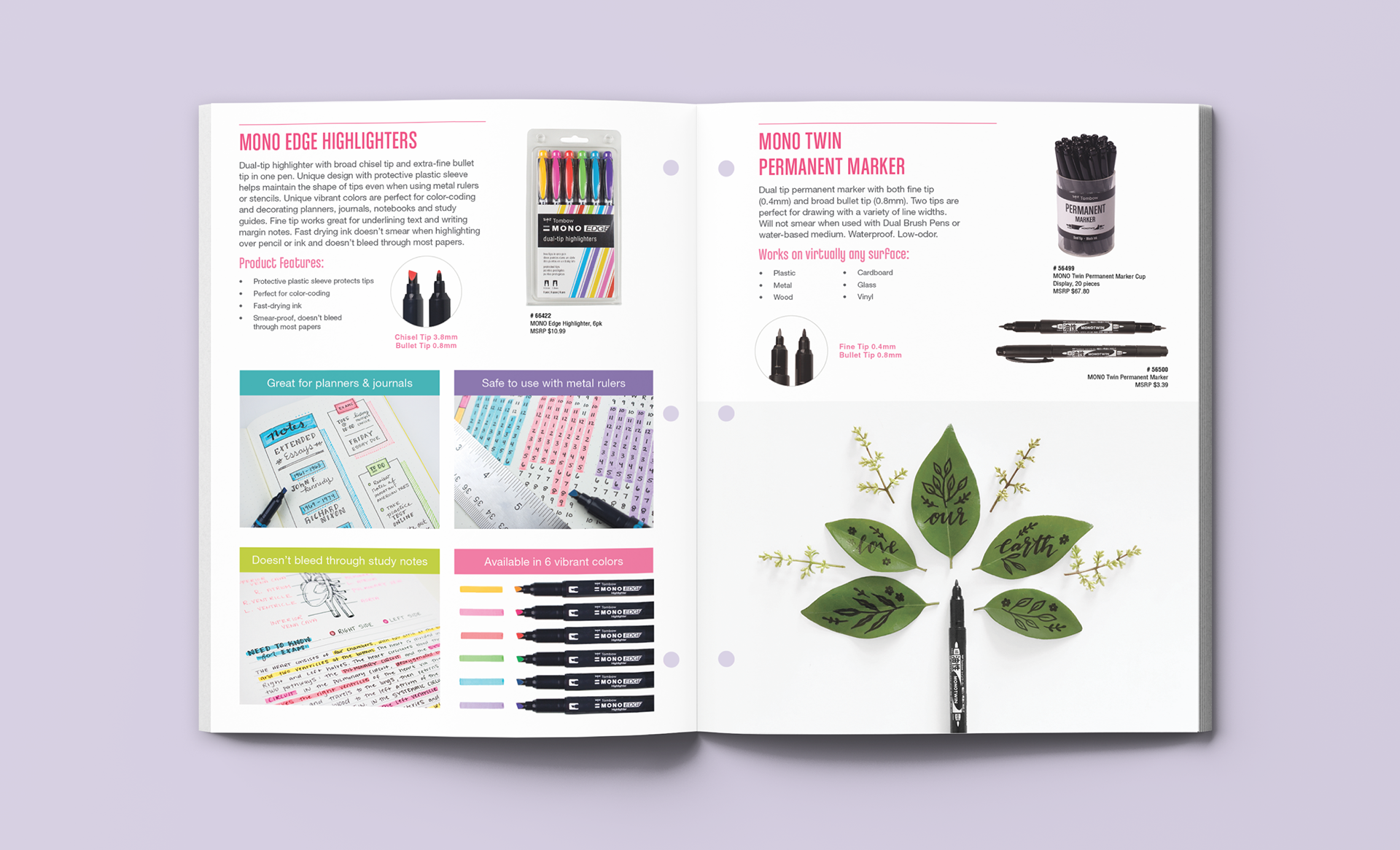
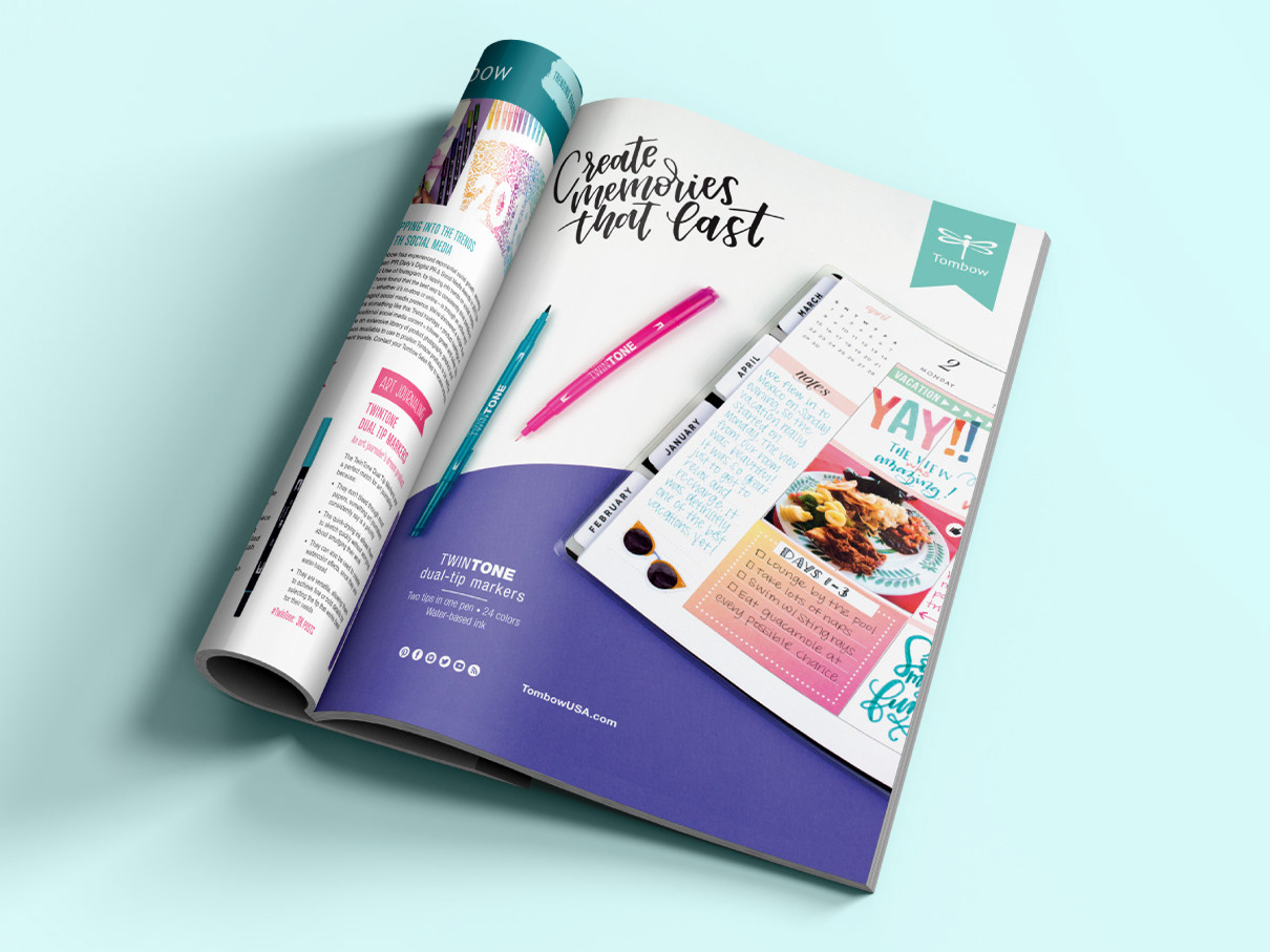
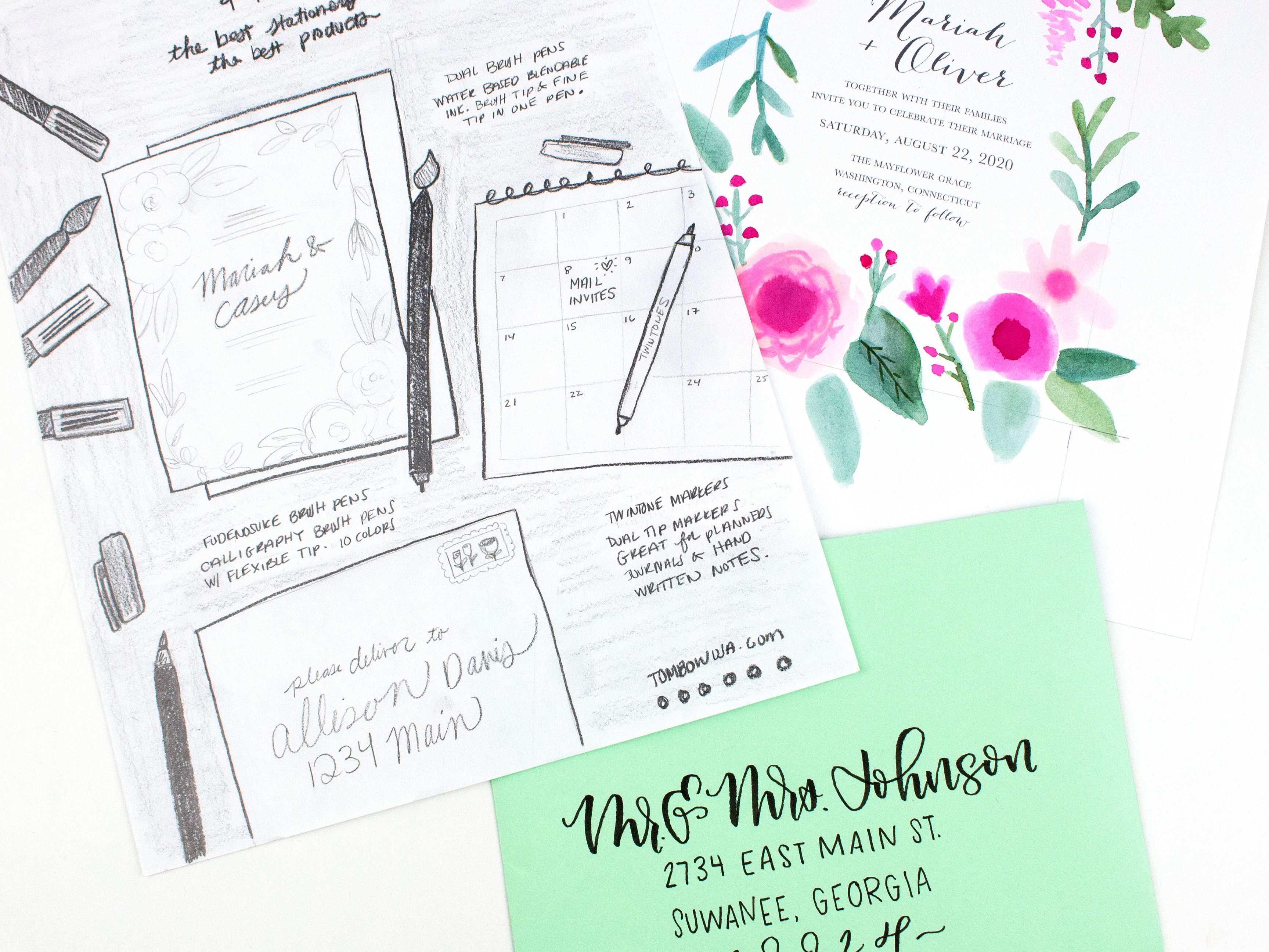
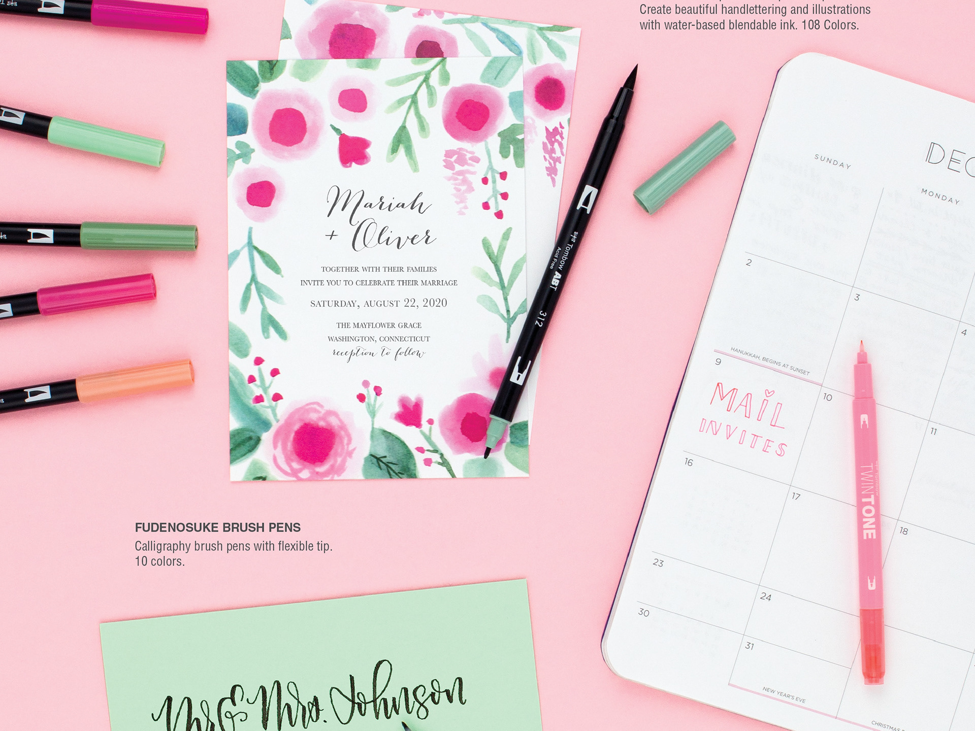
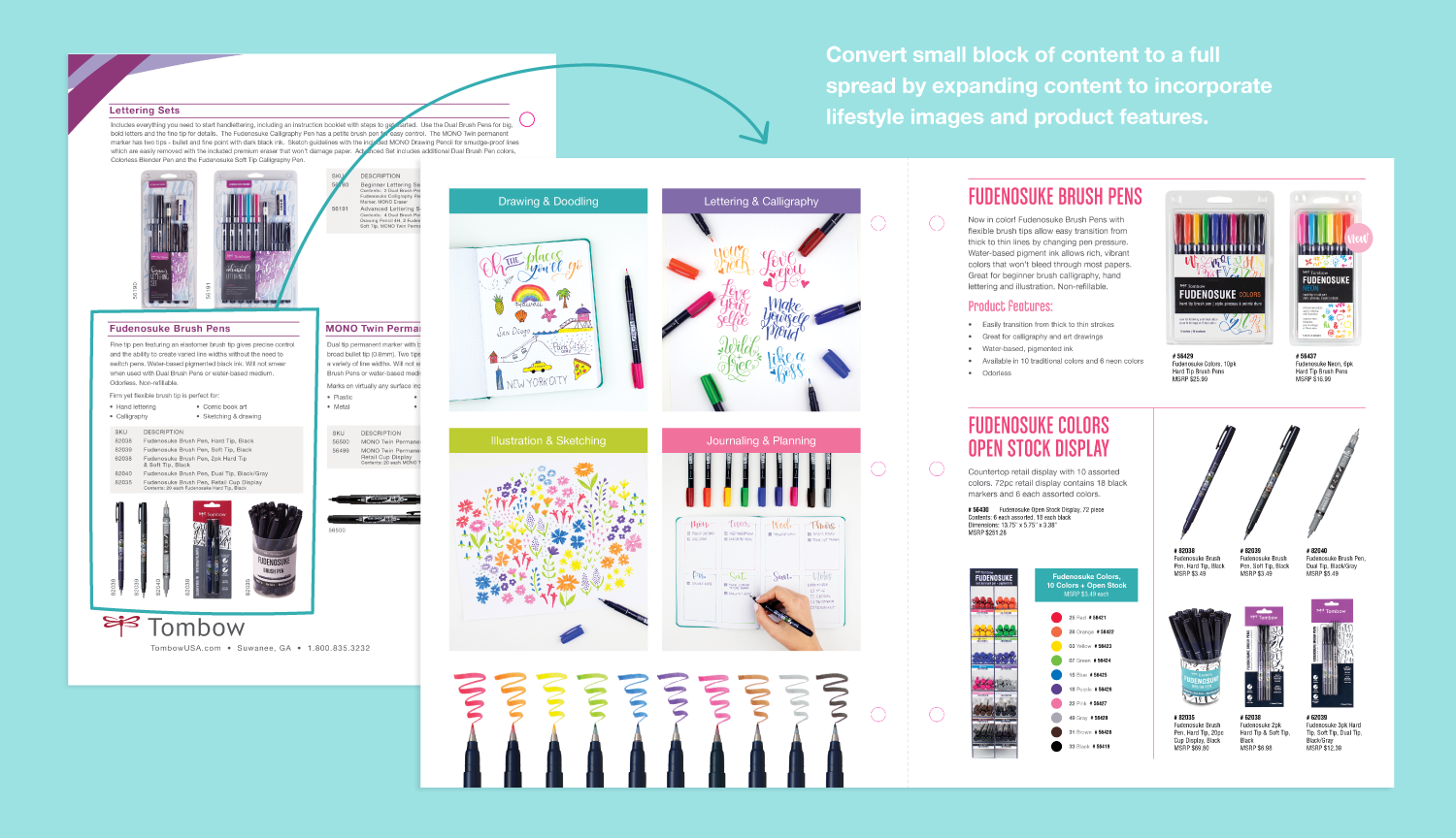
1) Lifestyle Photos That Relate to Current Trends: Rather than just showing a photo of the packaged markers, I wanted to showcase artwork created by the markers to highlight how products are being used by customers in the art and craft space and how they relate to current trends. For example, Fudenosuke Brush Markers are marketed as “calligraphy brush markers” but they can be used for drawing and doodling, lettering and calligraphy, illustration and sketching, and journaling and planning. In order to communicate that to buyers I created specific callouts incorporating photos of each usage category to show that this product is diverse and reaches multiple audiences.
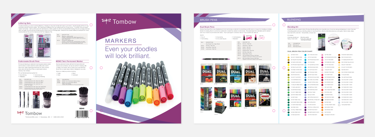
2) Detailed Product Copy: Rather than focus solely on factual product specs, I felt it was important to communicate information such as:
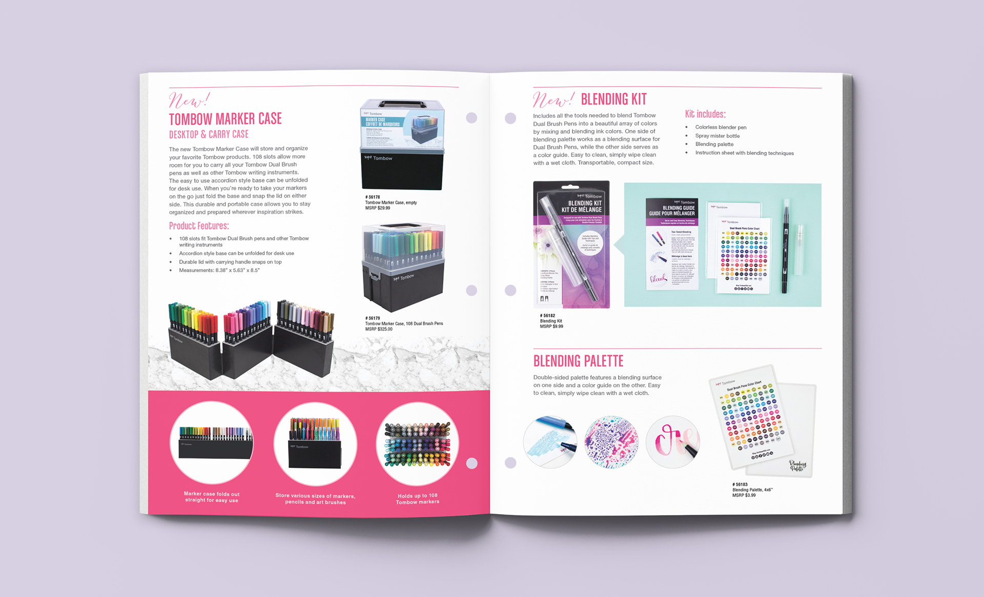
• Product Features: What makes this product unique and how does it stand out against competitor products?
Throughout the marker sell sheets, I incorporated bulleted lists and drop quotes to callout certain features of each product. (i.e. quicker drying time then gel pens, water-based ink doesn’t bleed through paper, long-lasting fiber tips maintains shape, etc.)
• Product Usage: What is this product used for?
When applicable, I included bulleted lists to inform the buyer how the product is used (i.e. watercolor, fine art, illustration, hand lettering, writing, journaling, etc.)
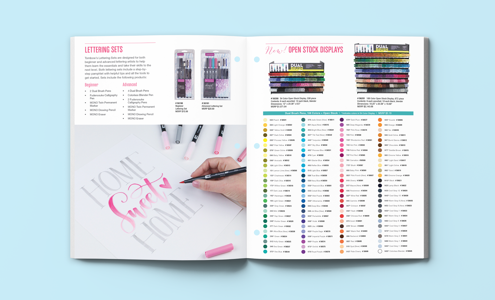
• Color Swatches: What are the specific colors included in each set?
If products are packaged in sets, I included color swatches in each packaged item so that buyers could make educated purchase decisions on the spot without additional research.
• Product Pricing: What does this product cost as an open stock item, versus as a packaged item?
Product pricing wasn’t included in the original marker sell sheet design which was a major issue for buyers who focus a large part of their decisions on price. To solve that problem, prices were added to each product and grouped with SKUs and product descriptions so that the pertinent information was quickly accessible.

3) Product Categories: How do these products relate to each other?
In the original design of the marker sell sheet, there were several product subcategories included on the same page which could be overwhelming and difficult when determining the differences between products. As a solution, I grouped products into subcategories and created spreads to showcase all products available in that family. For example, the TwinTone Dual-Tip Markers category spread includes all three 12-pack sets, the open stock display and a list of all 36 open stock markers by color. Designing layouts in this way allows for the buyer to see a big picture overview of the full product line and what is available so that they can compare products and make informed decisions.
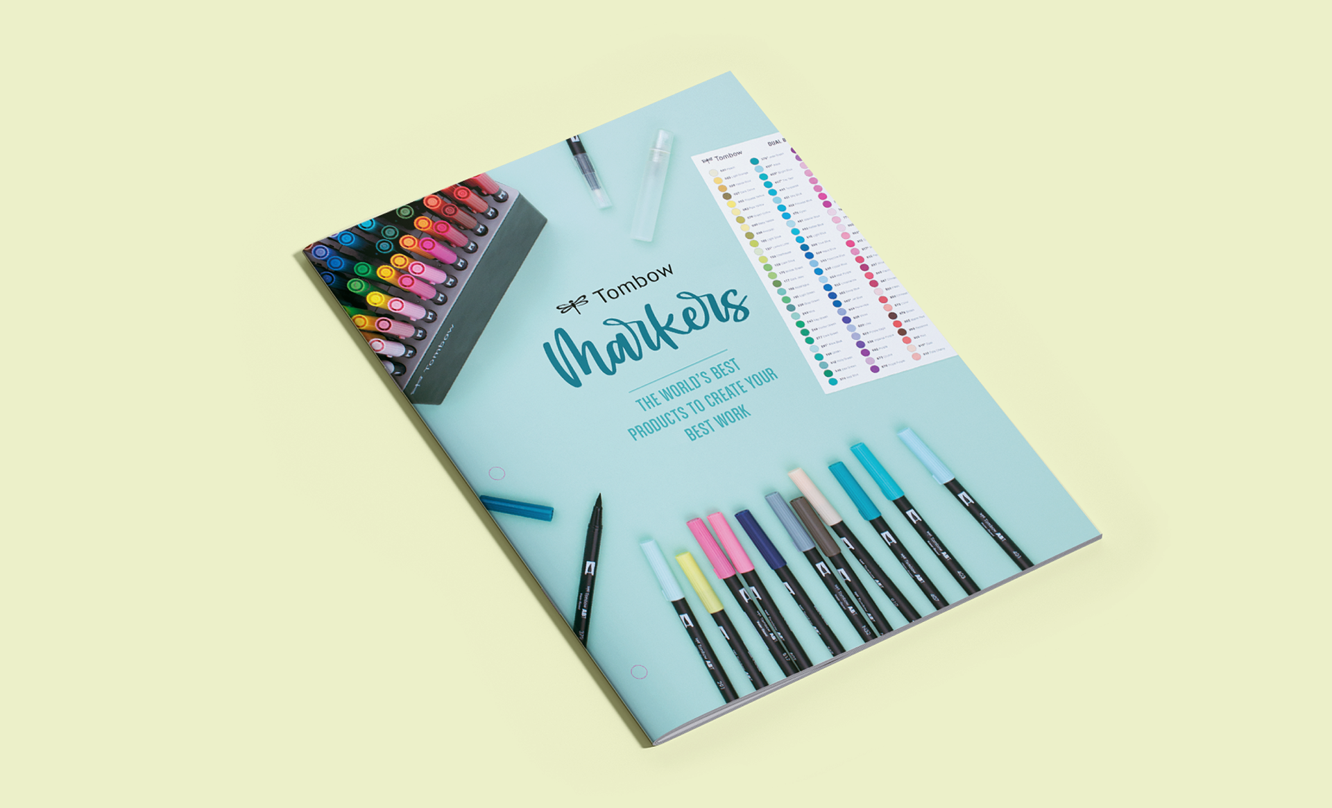
The Result
The spreads below showcase the final results of the Tombow Marker Sell Sheet. Incorporating the brand's social color palette, lifestyle imagery, and artwork created with their products helped to elevate this piece to better align with their audience and visually communicate their goals to stand current with trends.