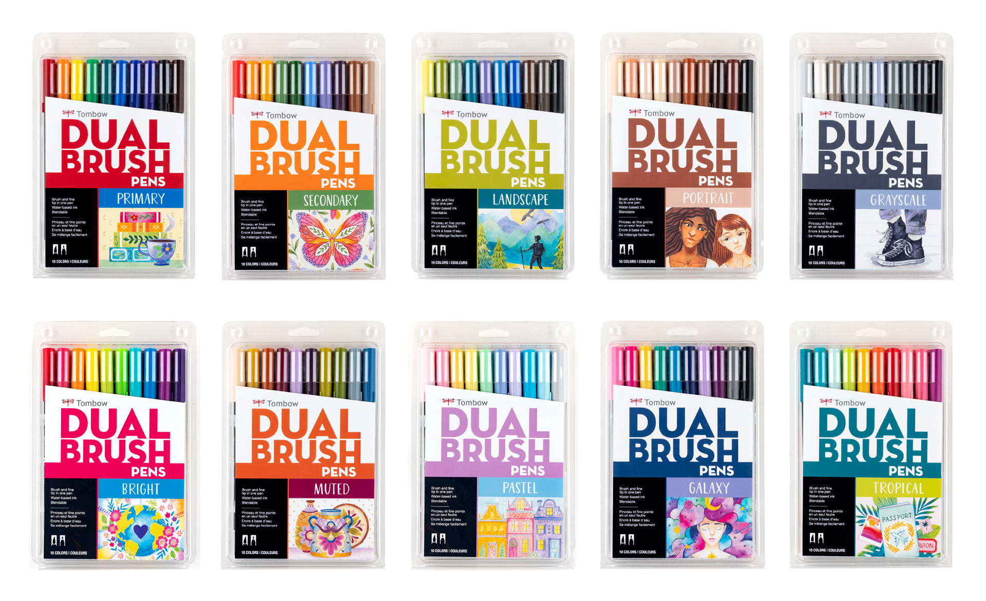
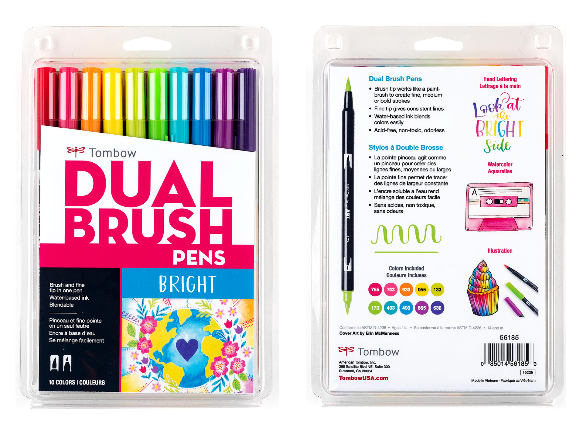
Dual Brush Pens are Tombow's most well-known and loved product, but the original packaging didn't exactly speak to their audience of artists, crafters, and hobbyists. The artwork specifically didn't represent the capabilities of Dual Brush Pen markers, and that's something we wanted to change in the refresh of this packaging.
We had two goals for packaging artwork:
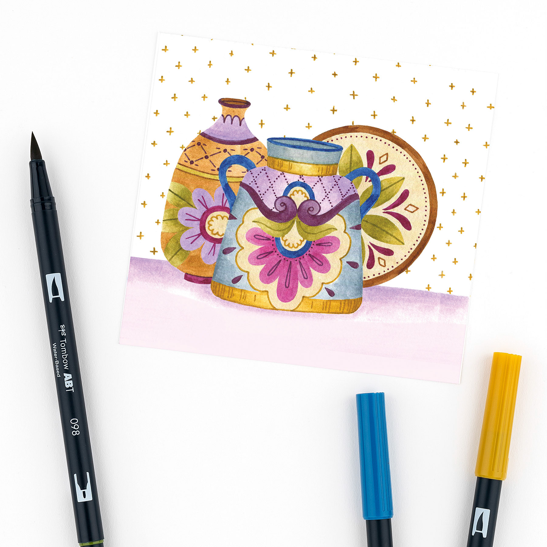
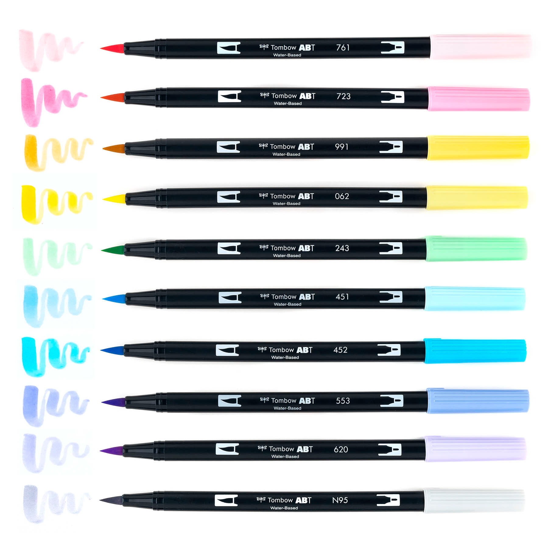
Goal #1: Work with an artist who knows and loves Tombow products and can demonstrate how these markers can be used for illustration and watercolor purposes. We decided to work with Erin McManness of Paper Raven Co., who did a marvelous job bringing our ideas and concepts to life. You'll see in the artwork below she successfully demonstrates the variety of uses of the marker by incorporating varying brush weights, blending and watercolor techniques.
Goal #2: Create a concept behind each illustration that means something to our audience and relates to trends and causes they care about. Below, I outline the main communication objective for each color palette by highlighting the concept behind the artwork.
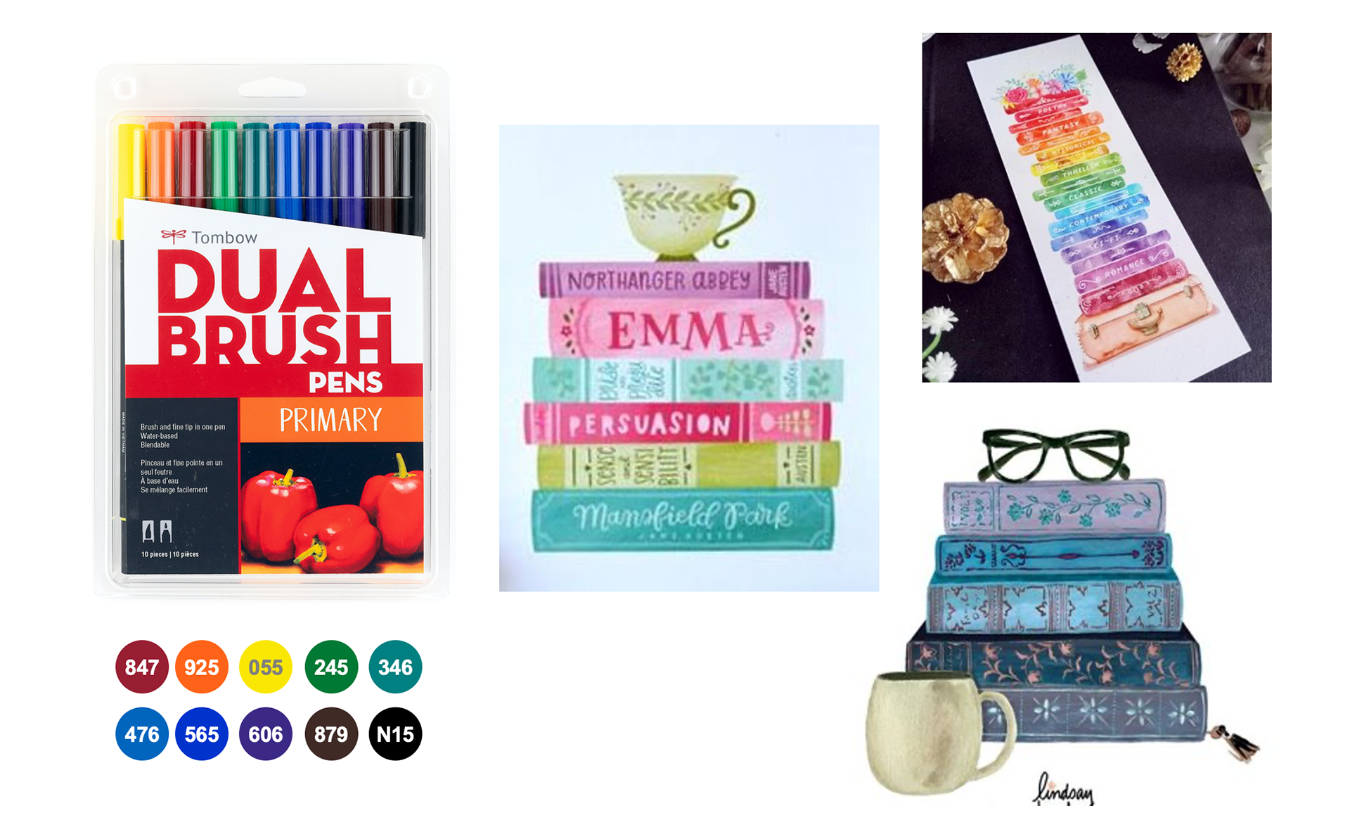
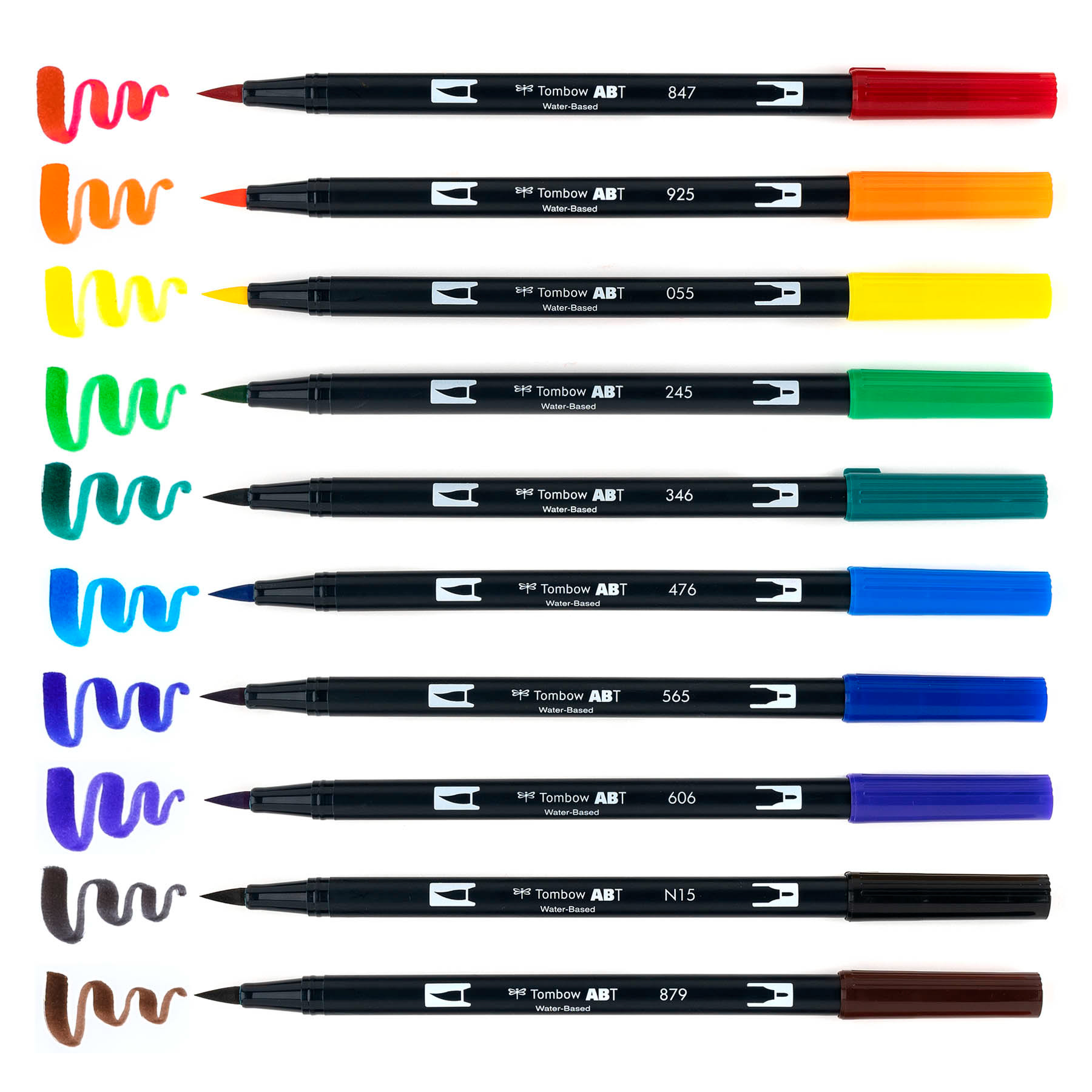
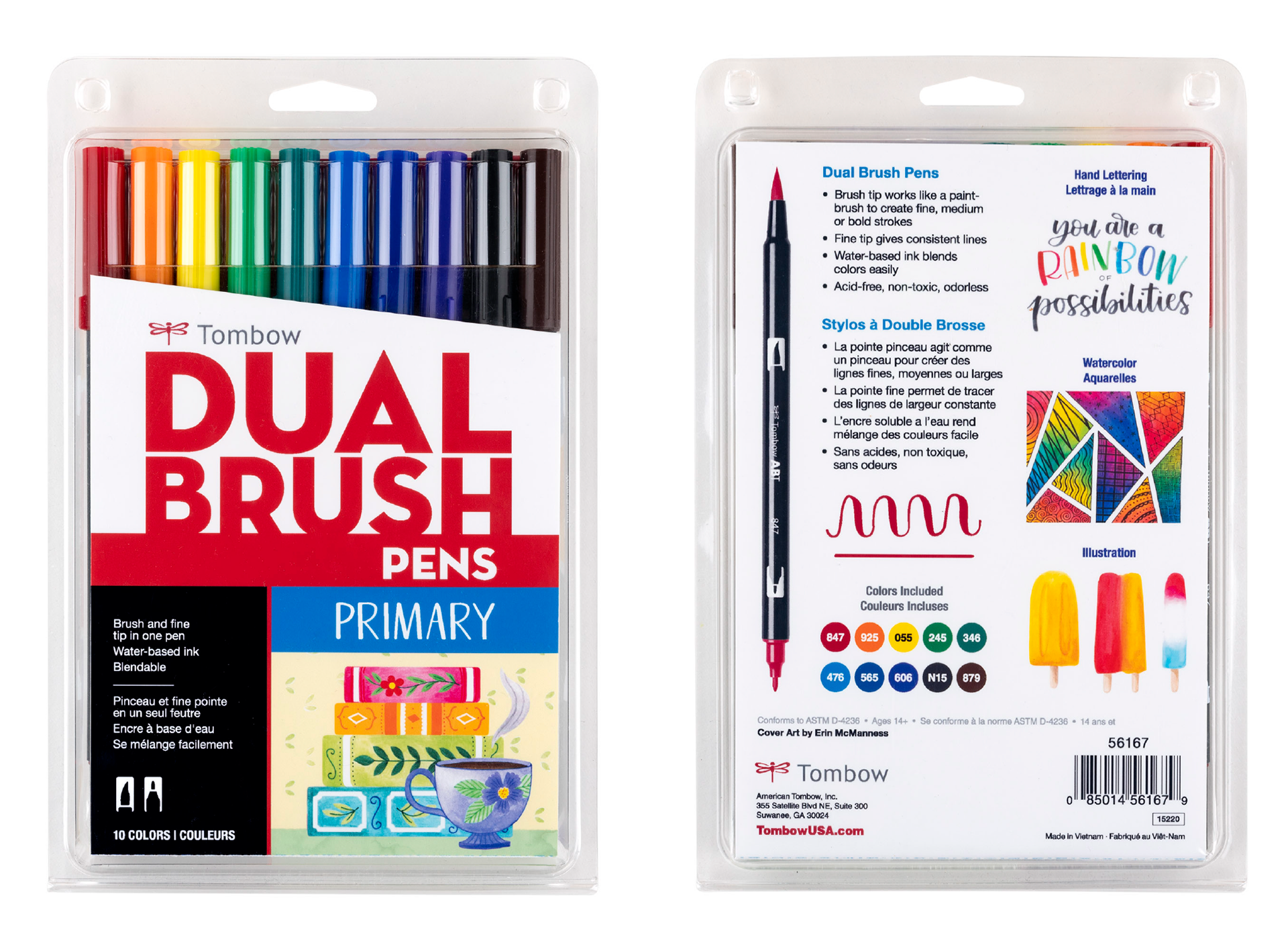
Primary Palette
Art Direction
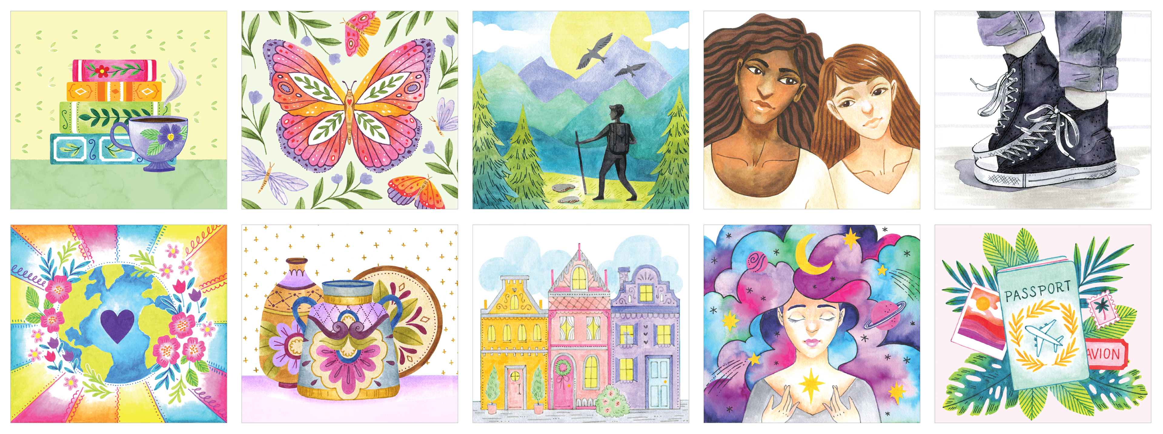
The goal of the Primary set artwork is to illustrate a cozy environment for a reader, to make it look like they just sat down to read a book with a cup of tea. We wanted the artwork to be vibrant, incorporating rainbow colors on the stack of books, with fun decorative elements like detailed borders, patterns, and textures.

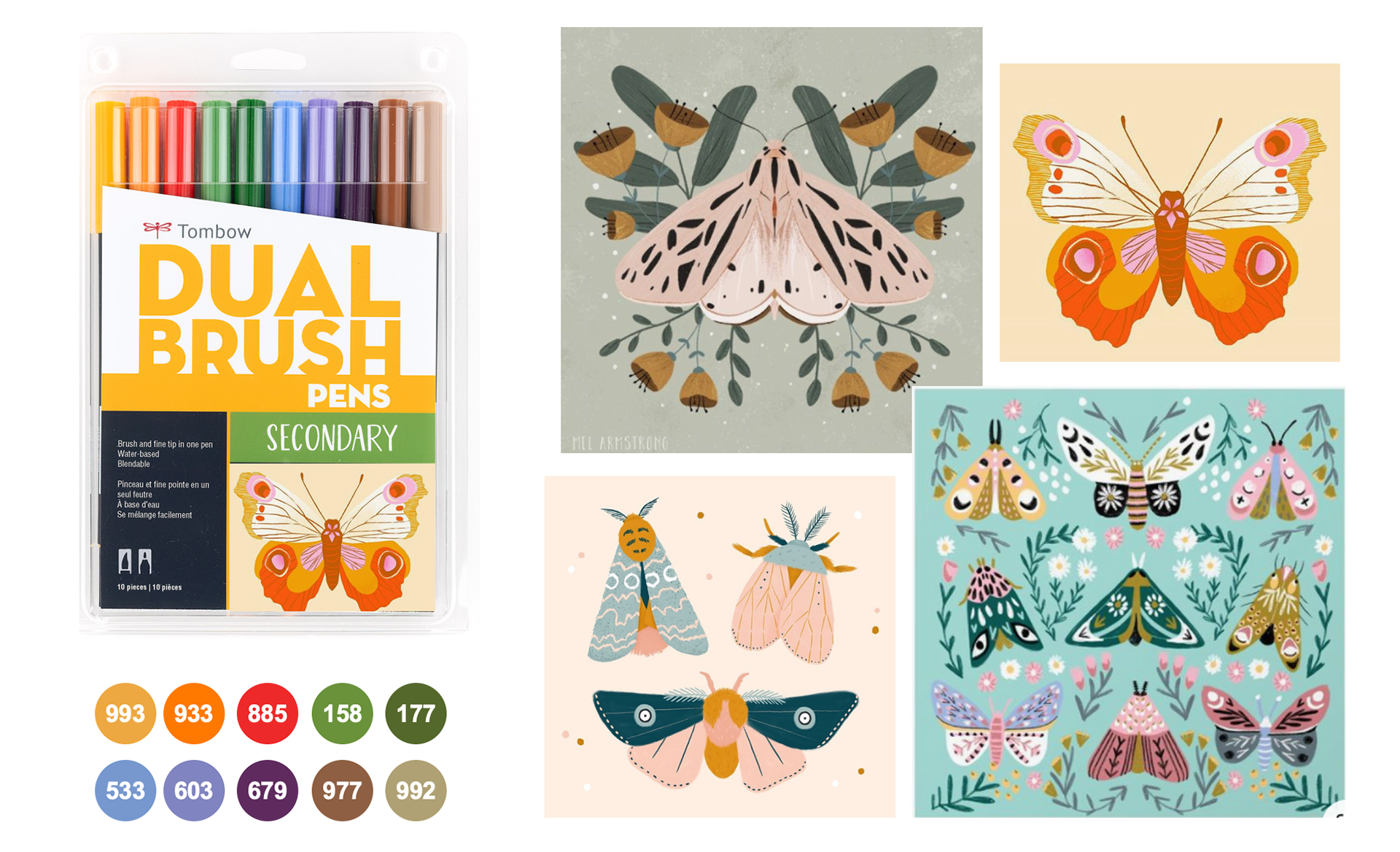
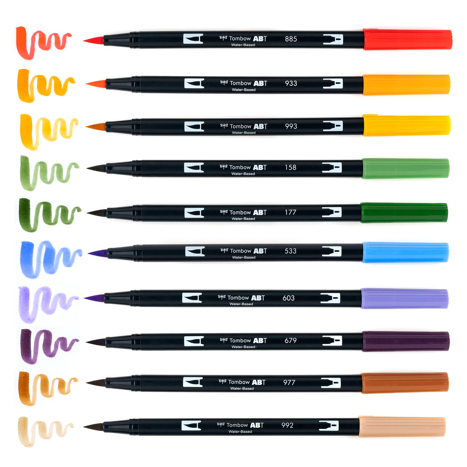
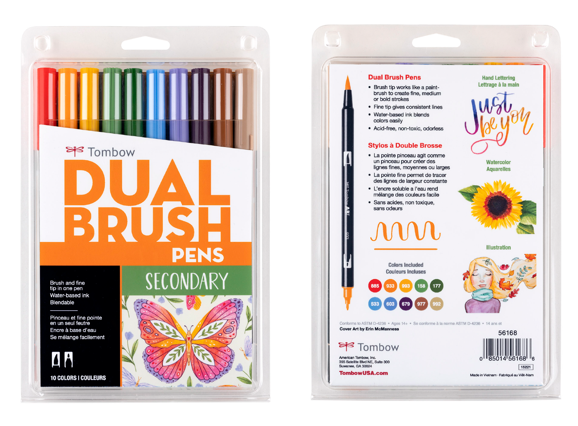
Secondary Palette
Art Direction
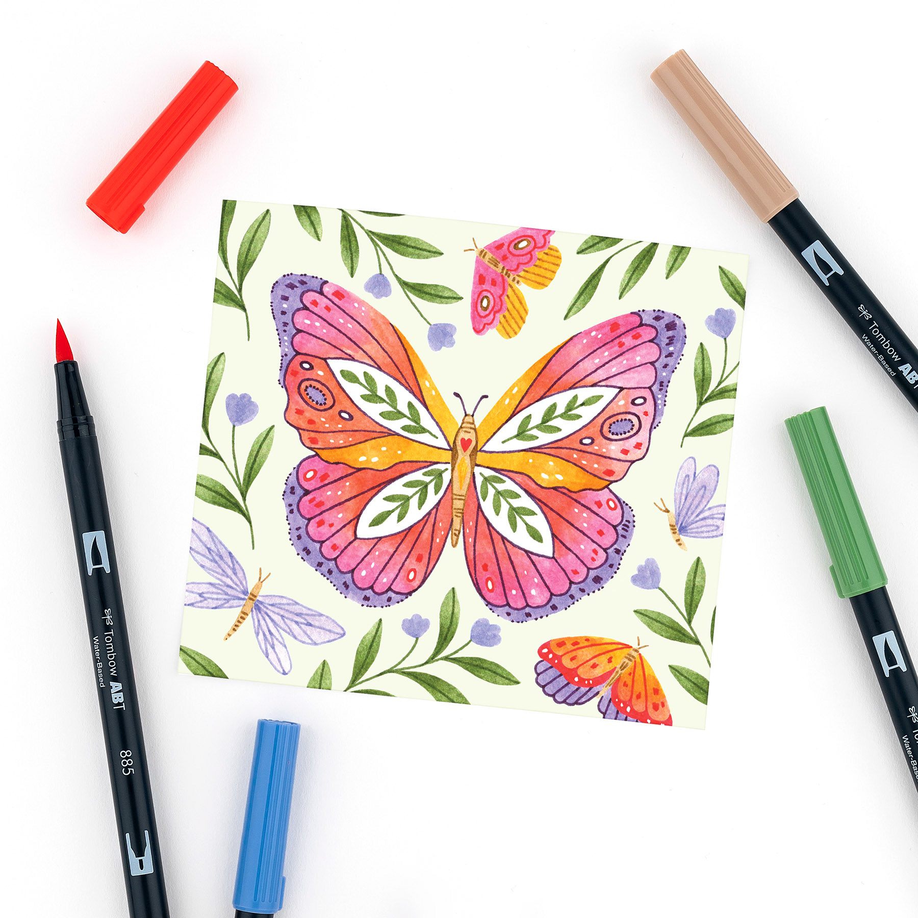
The goal of the Secondary set artwork is to illustrate a whimsical butterfly to portray the message of finding charm and beauty in the ordinary. We wanted a unique interpretation of a butterfly that incorporates patterns, interesting shapes, floral elements, dots, line work, etc.
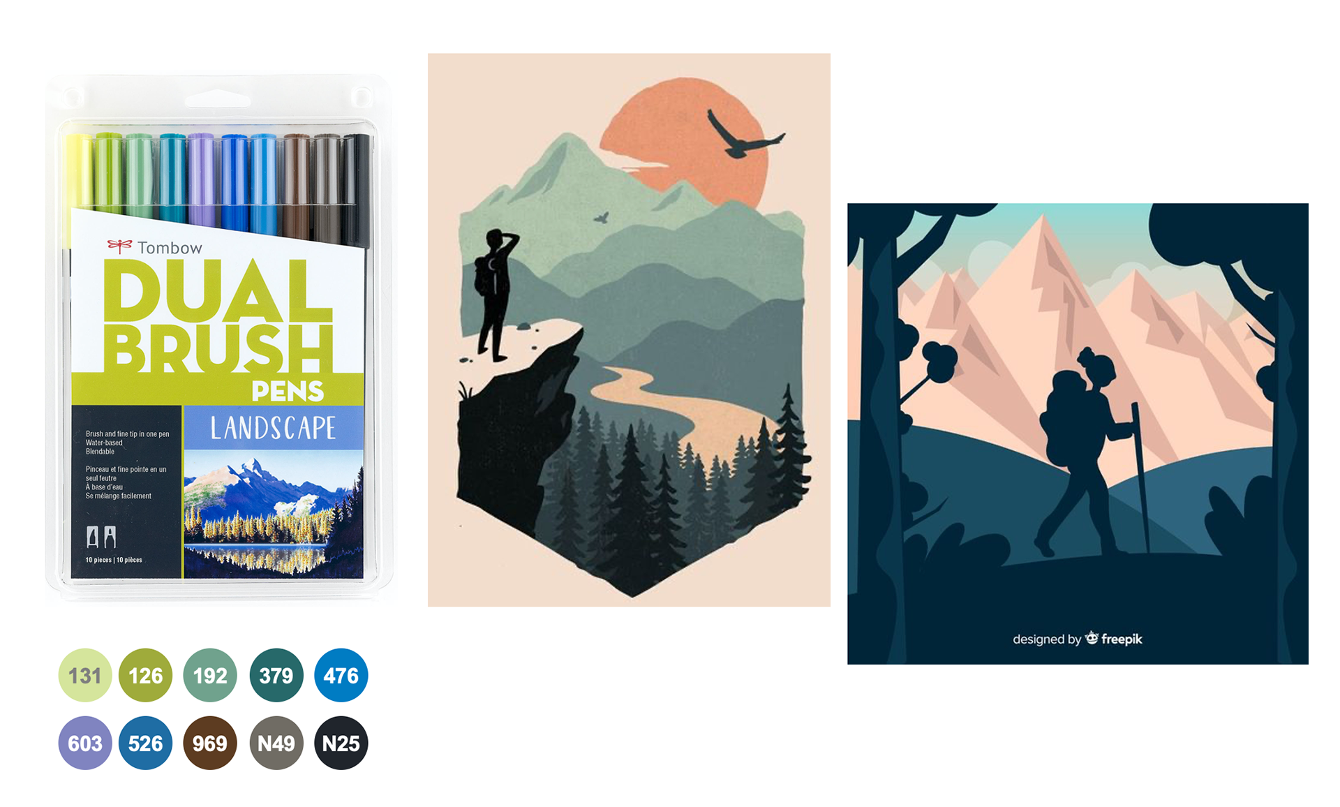
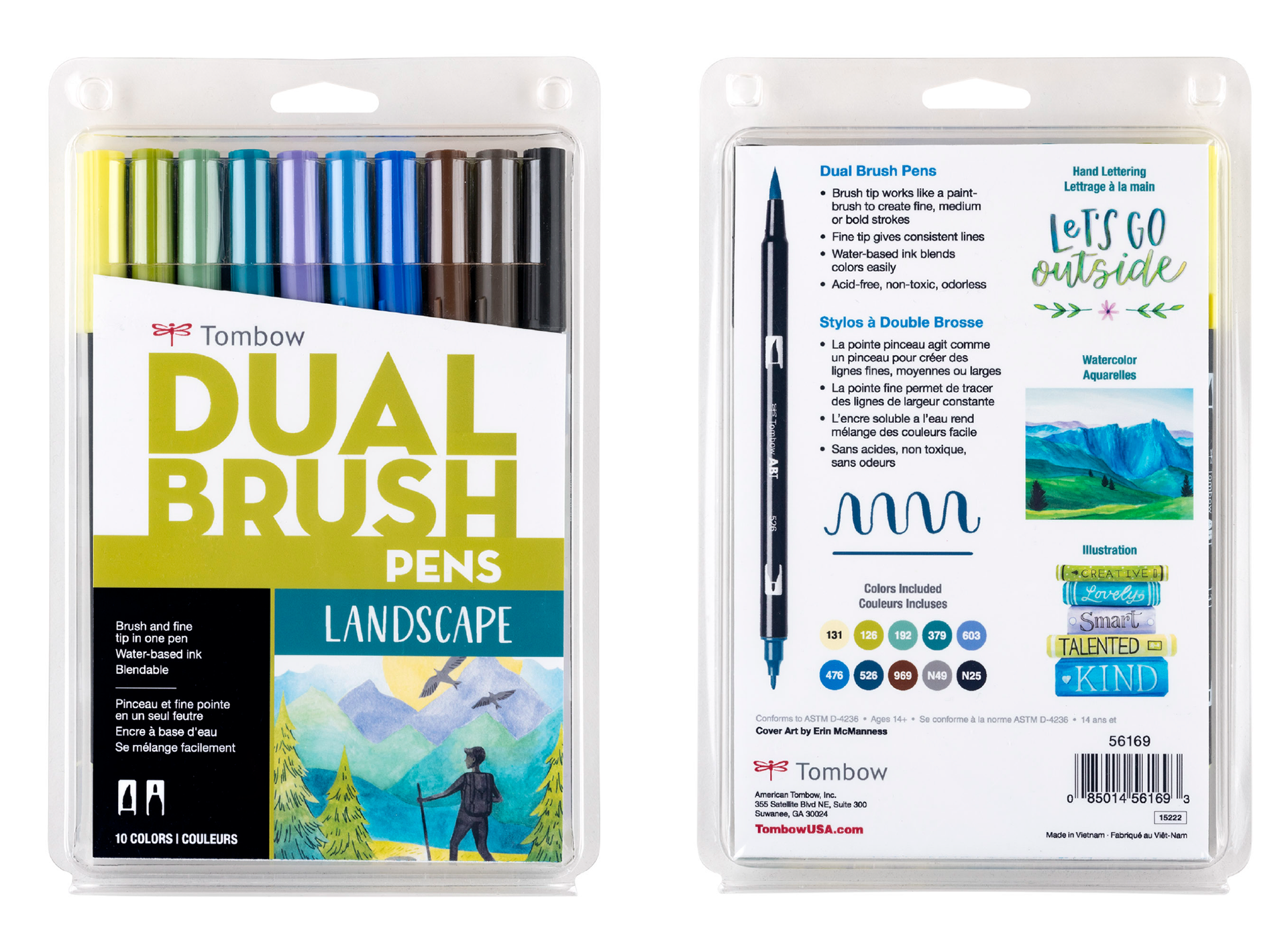
Landscape Palette
Art Direction
The goal of the Landscape set artwork is to portray the message of exploration and adventure. We wanted the artwork to include a silhouette of a hiker with mountains in the background with other elements of nature, like a bird, trees, rocks, etc.

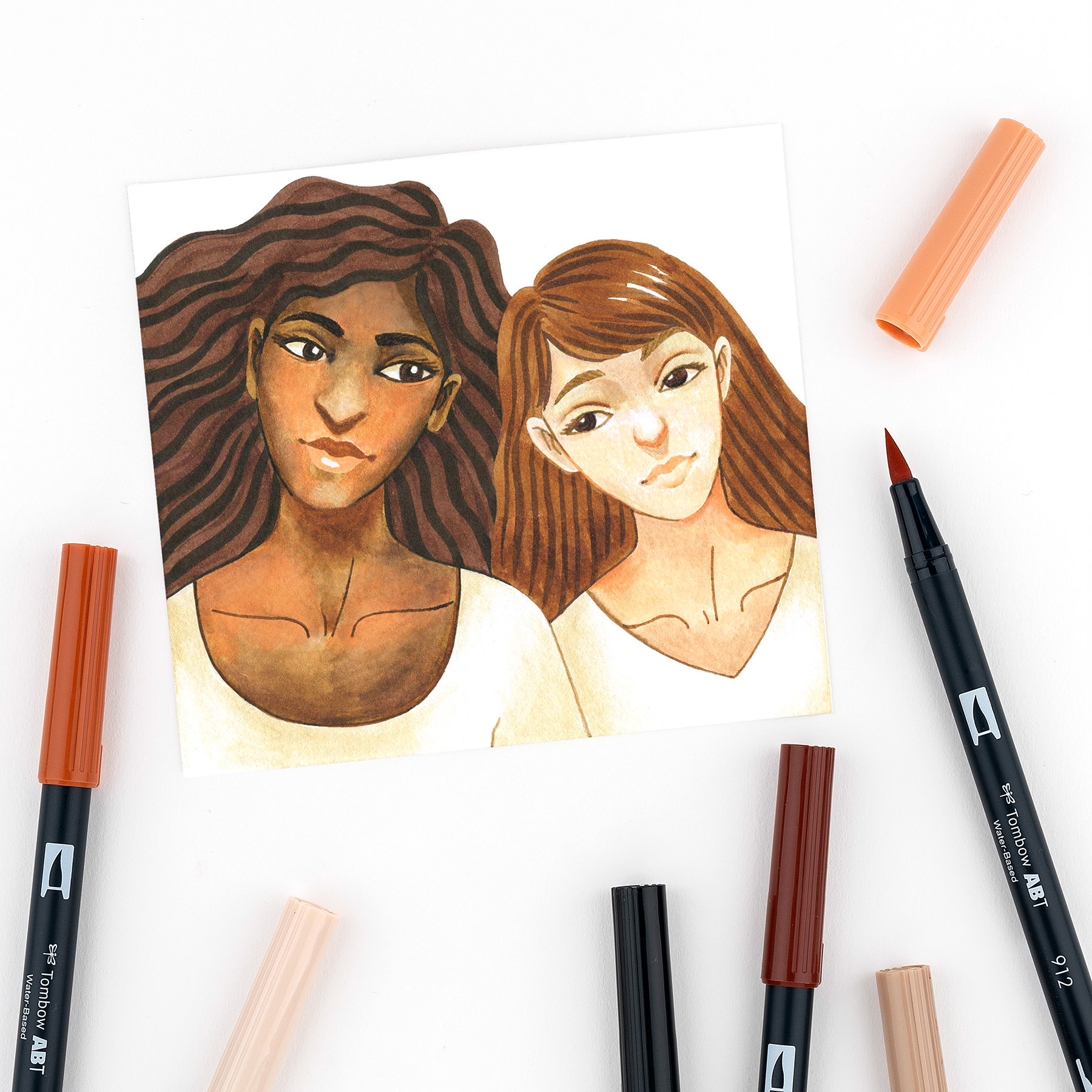
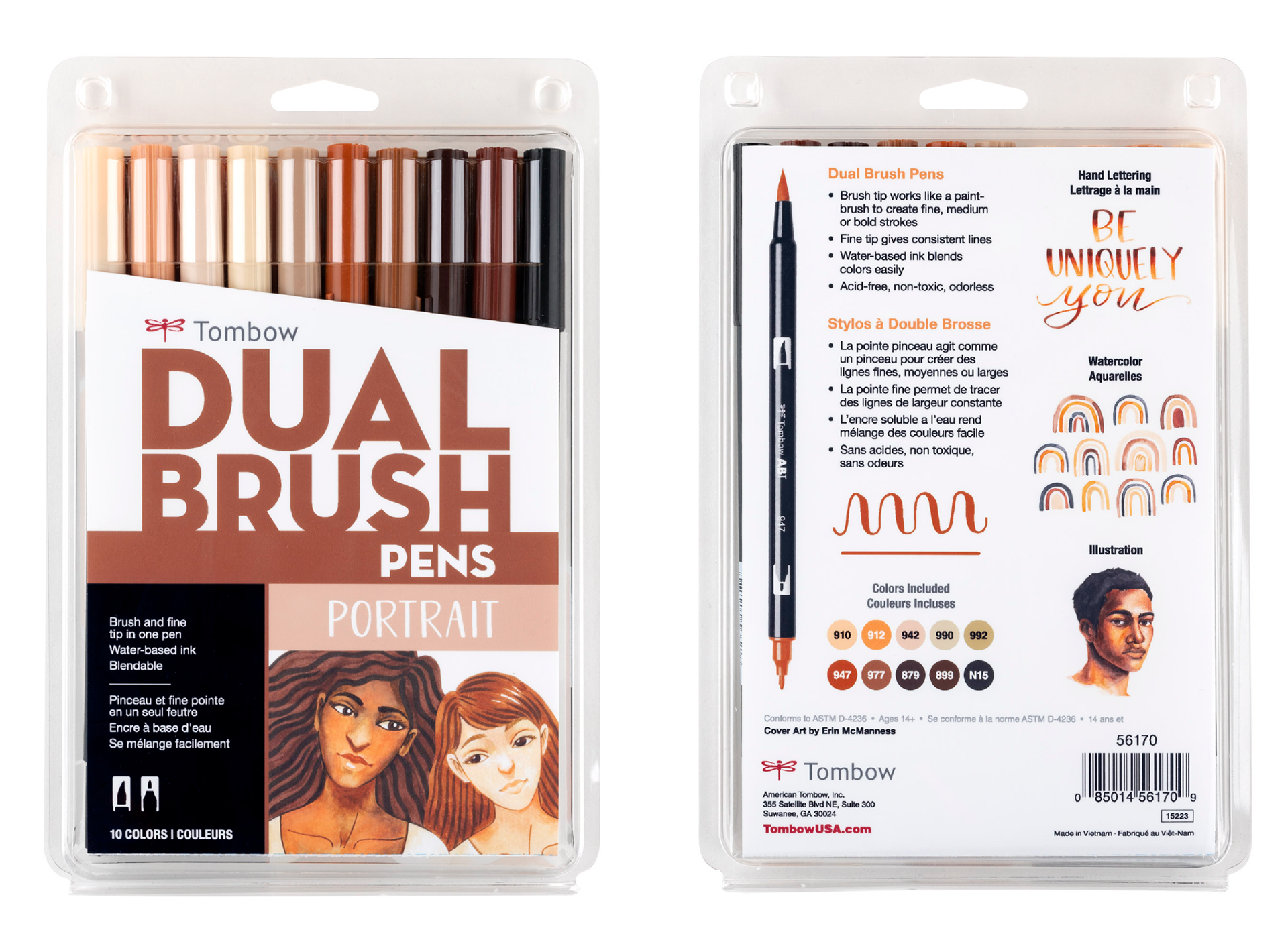
Portrait Palette
Art Direction
The goal of the Portrait set artwork is to illustrate diversity and inclusivity among women. We'd like to showcase that more than one skin tone can be achieved with colors included in the set and would like the artwork to communicate friendship, love and support.
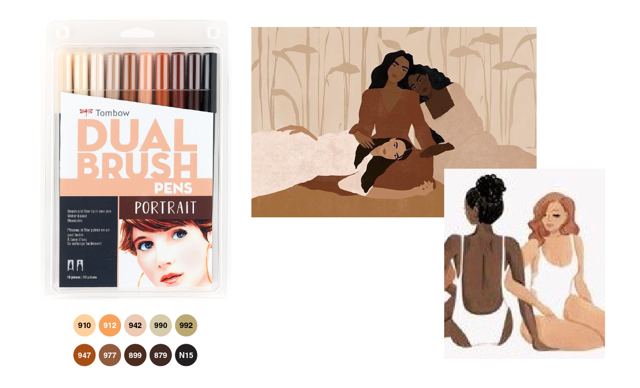
Inspiration Moodboard – Portrait Set
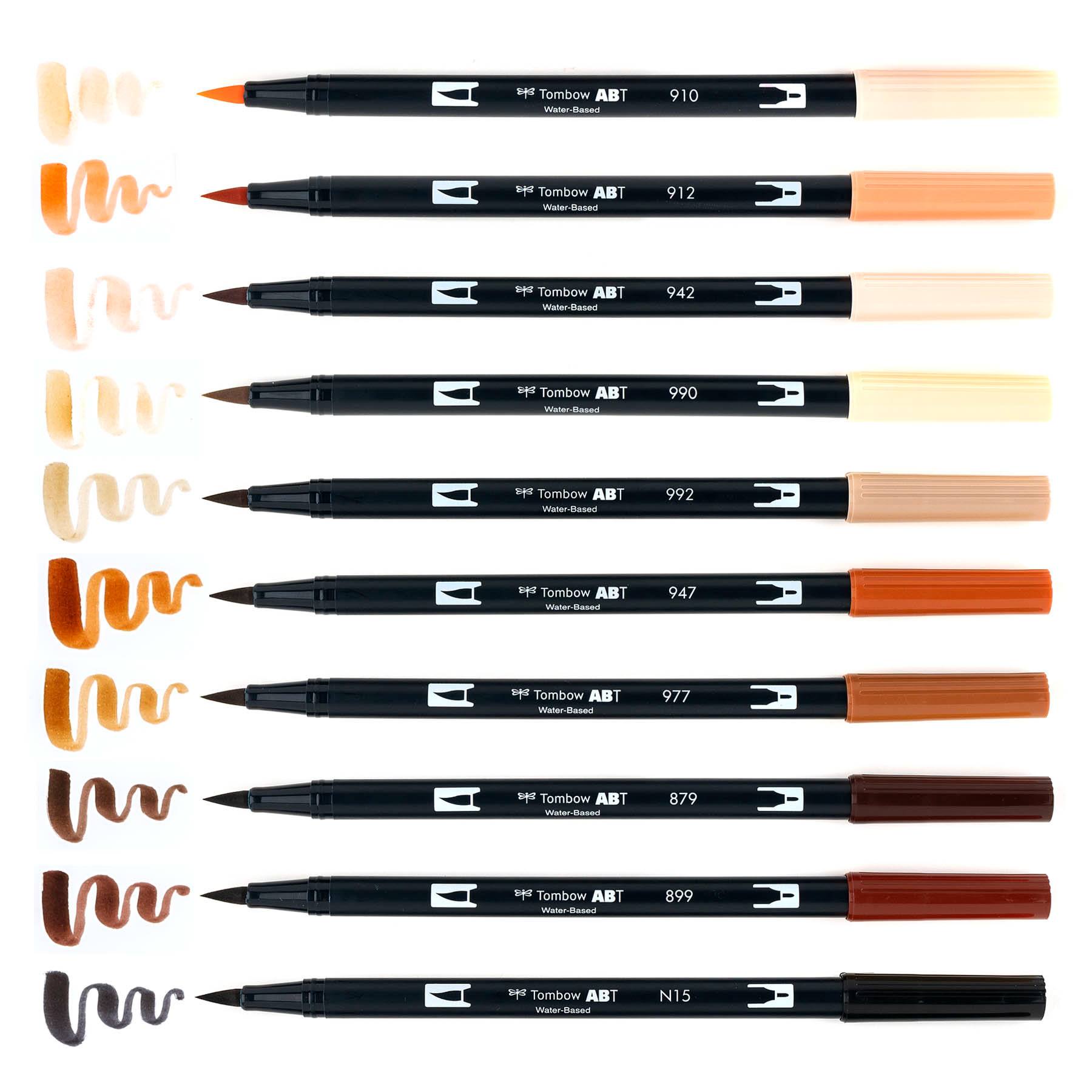
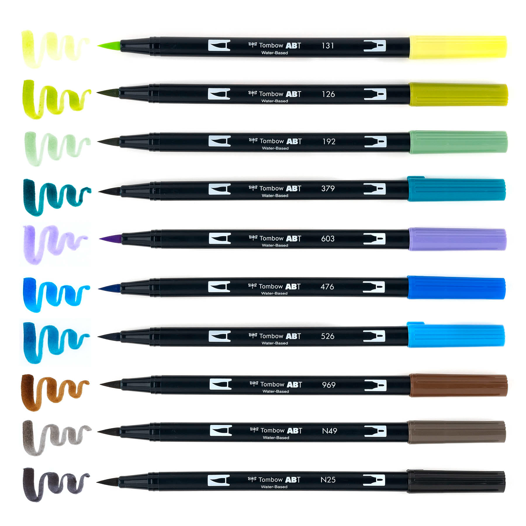
Markers Included – Portrait Set
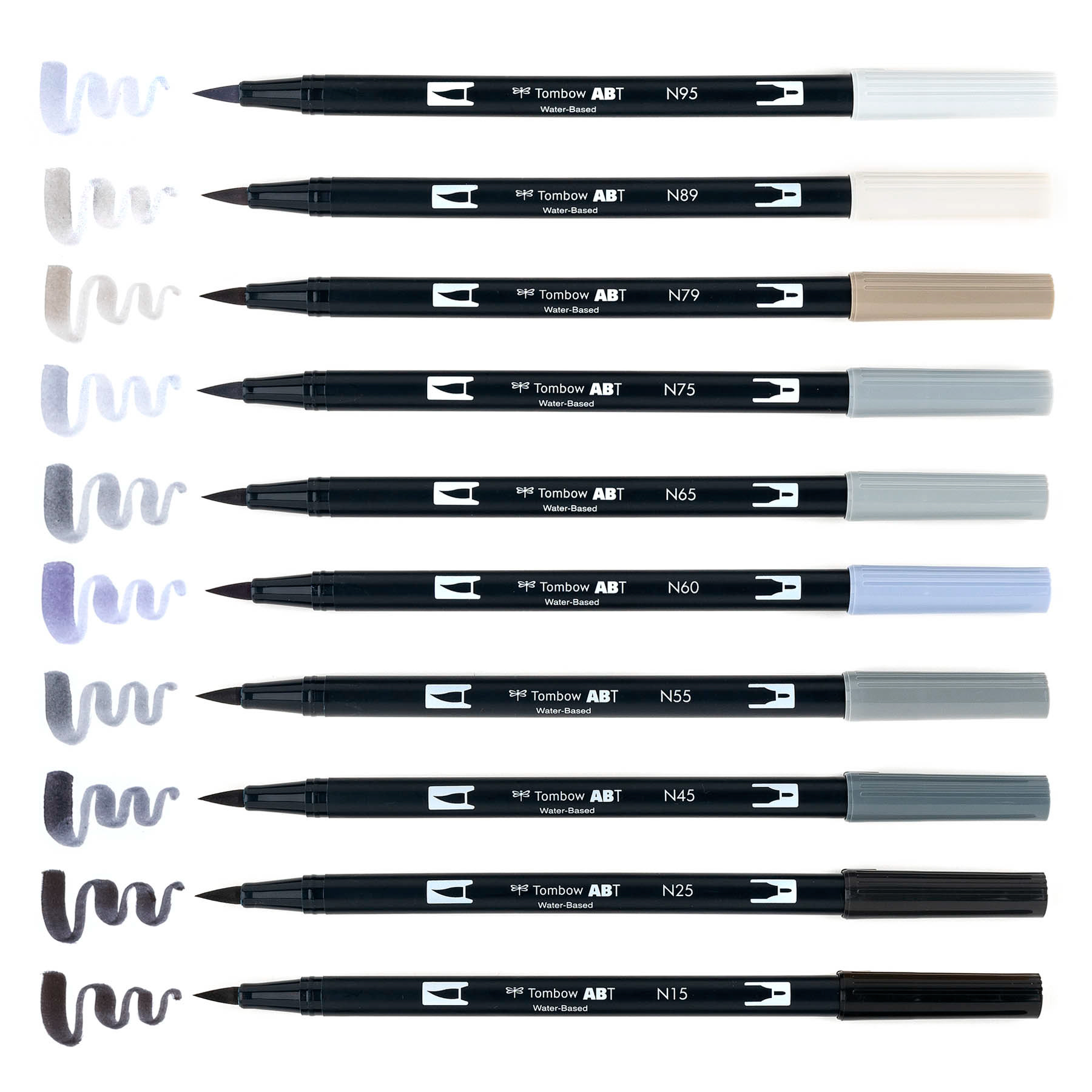
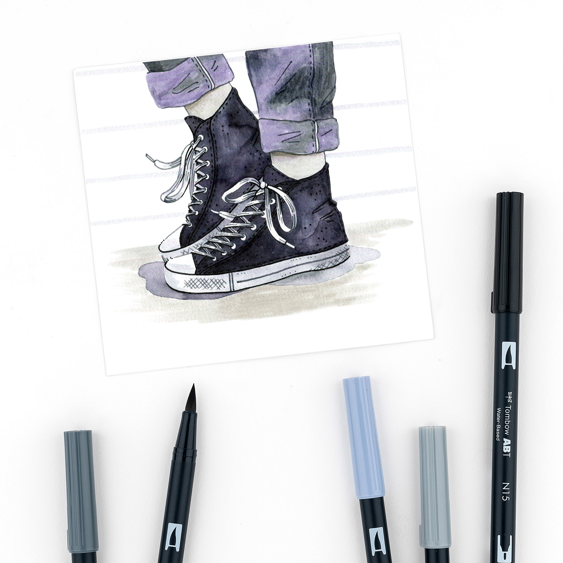
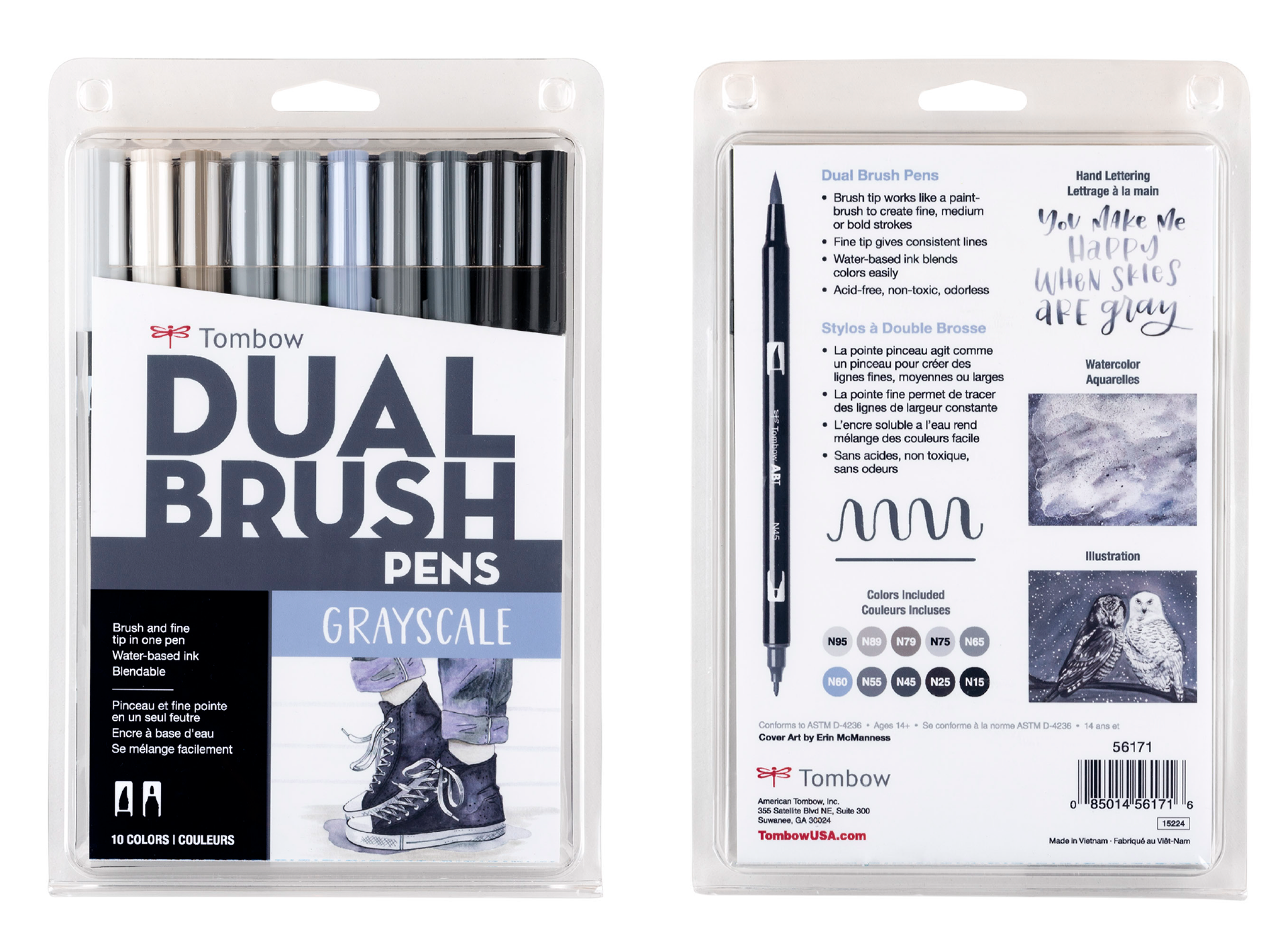
Grayscale Palette
Art Direction
The goal of the Grayscale set artwork is to give the viewer a sense of chill, cool kid vibes. We liked the casual, relaxed look and feel of the converse illustrations below and wanted to create a similar scene that focuses on textures and watercolor techniques.

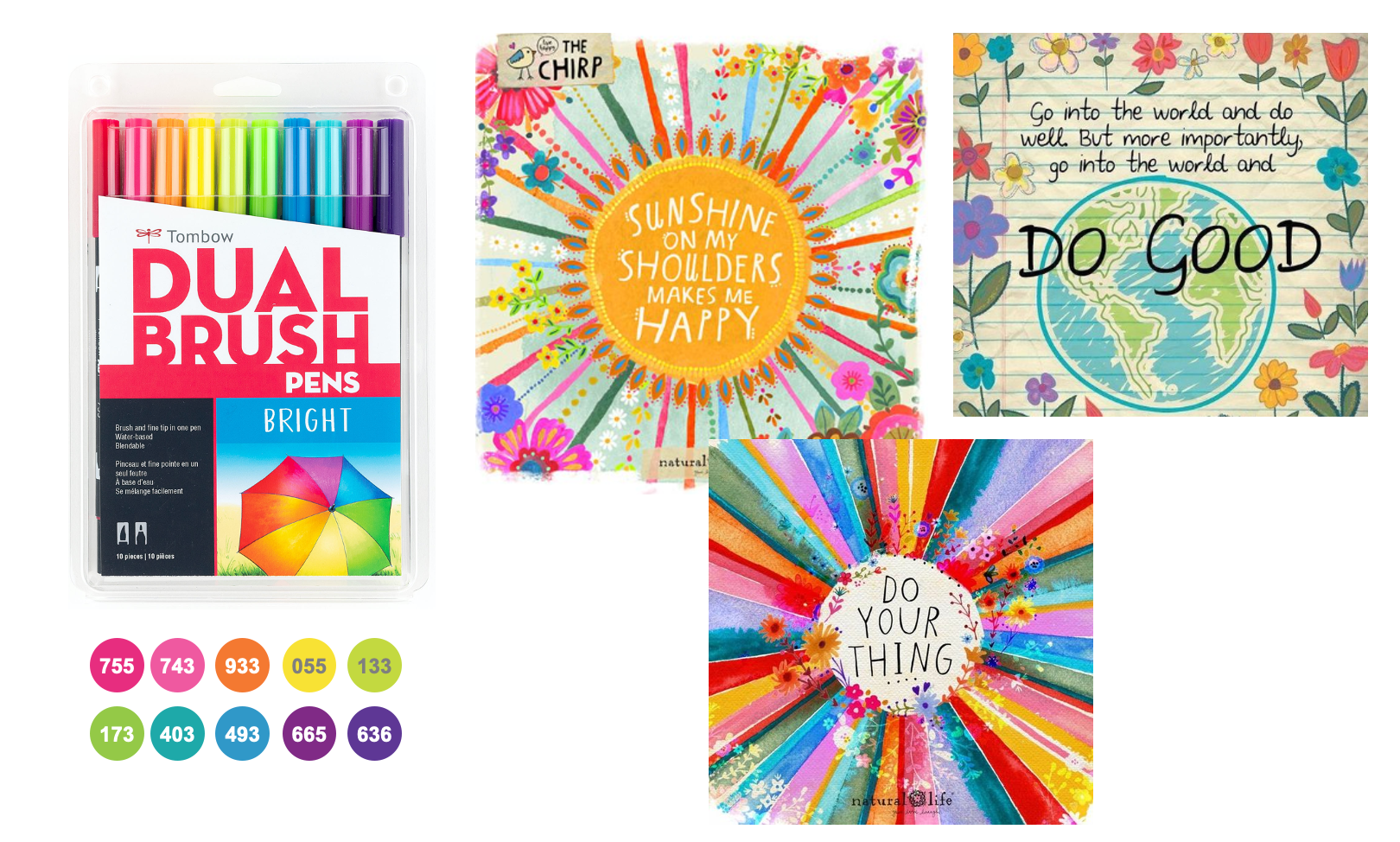
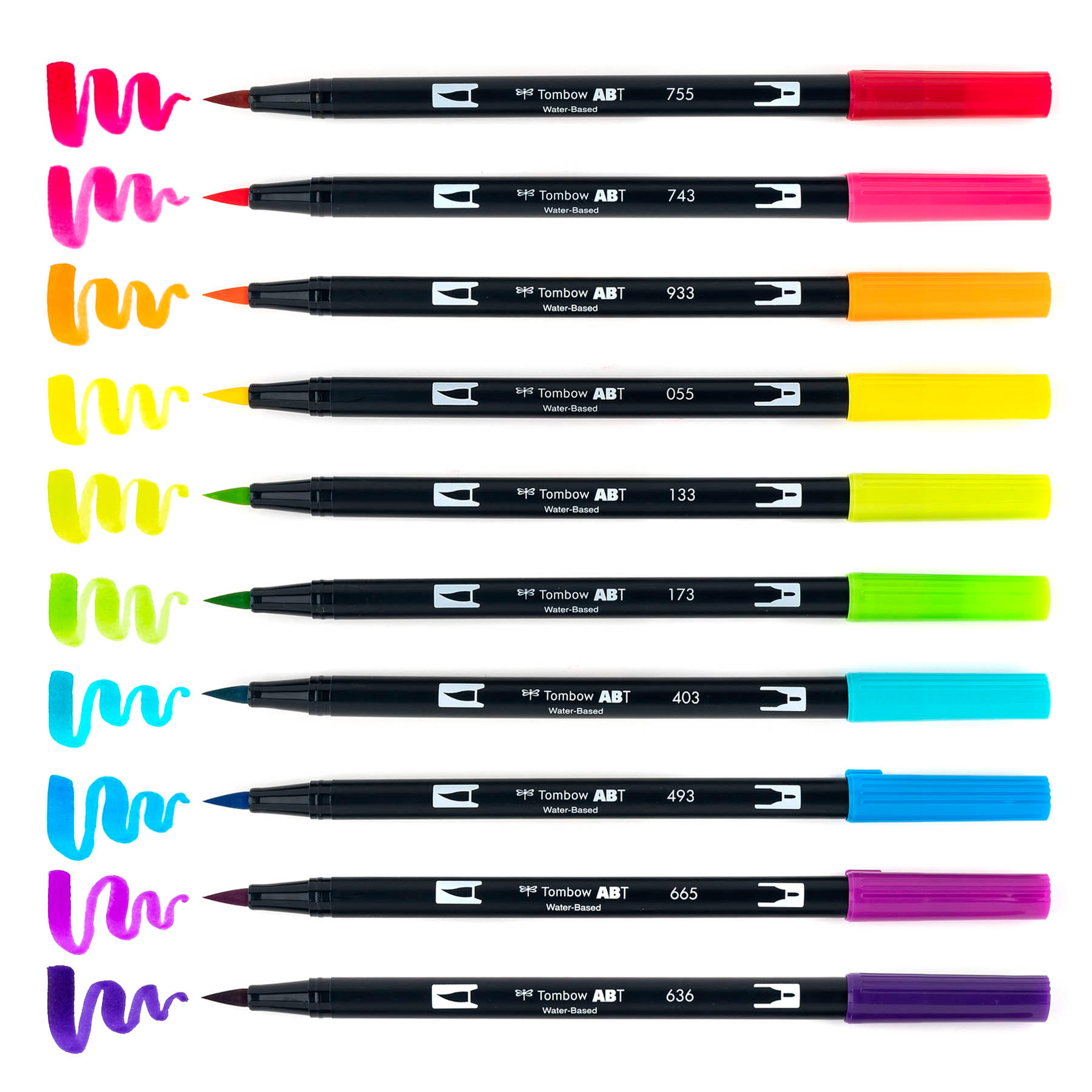
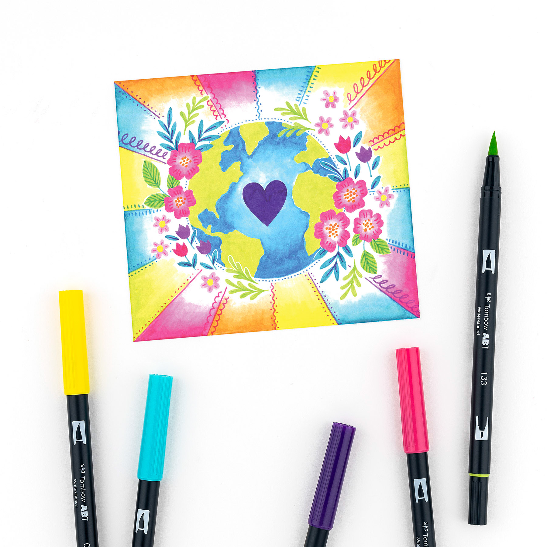
Bright Palette
Art Direction
The goal of the Bright set artwork is to portray the message of happiness and making the world a better place by spreading love and care. I was inspired by the artwork below and wanted a combination of elements of the earth with sun rays and bright colors illuminating from it, surrounded by flowers.
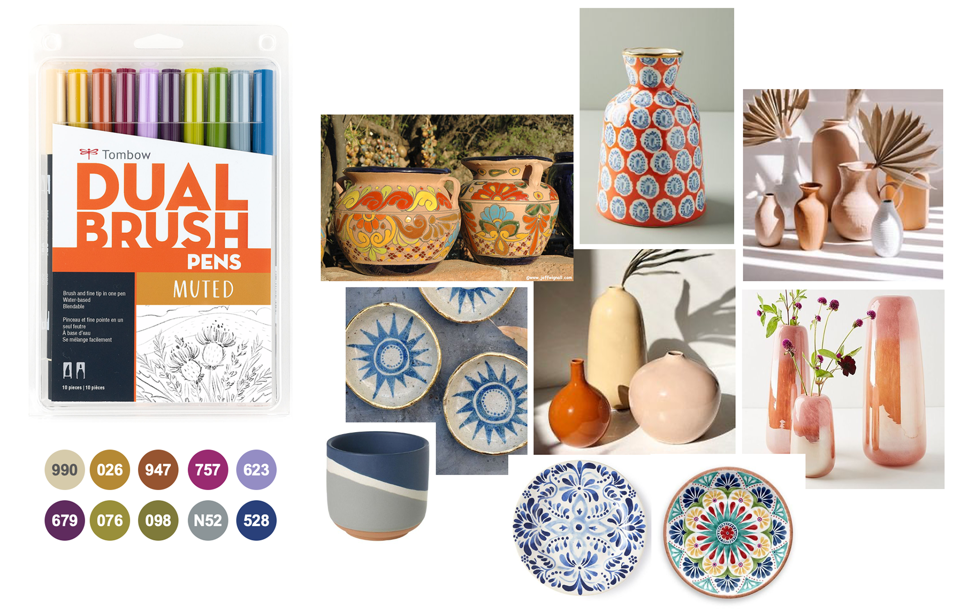
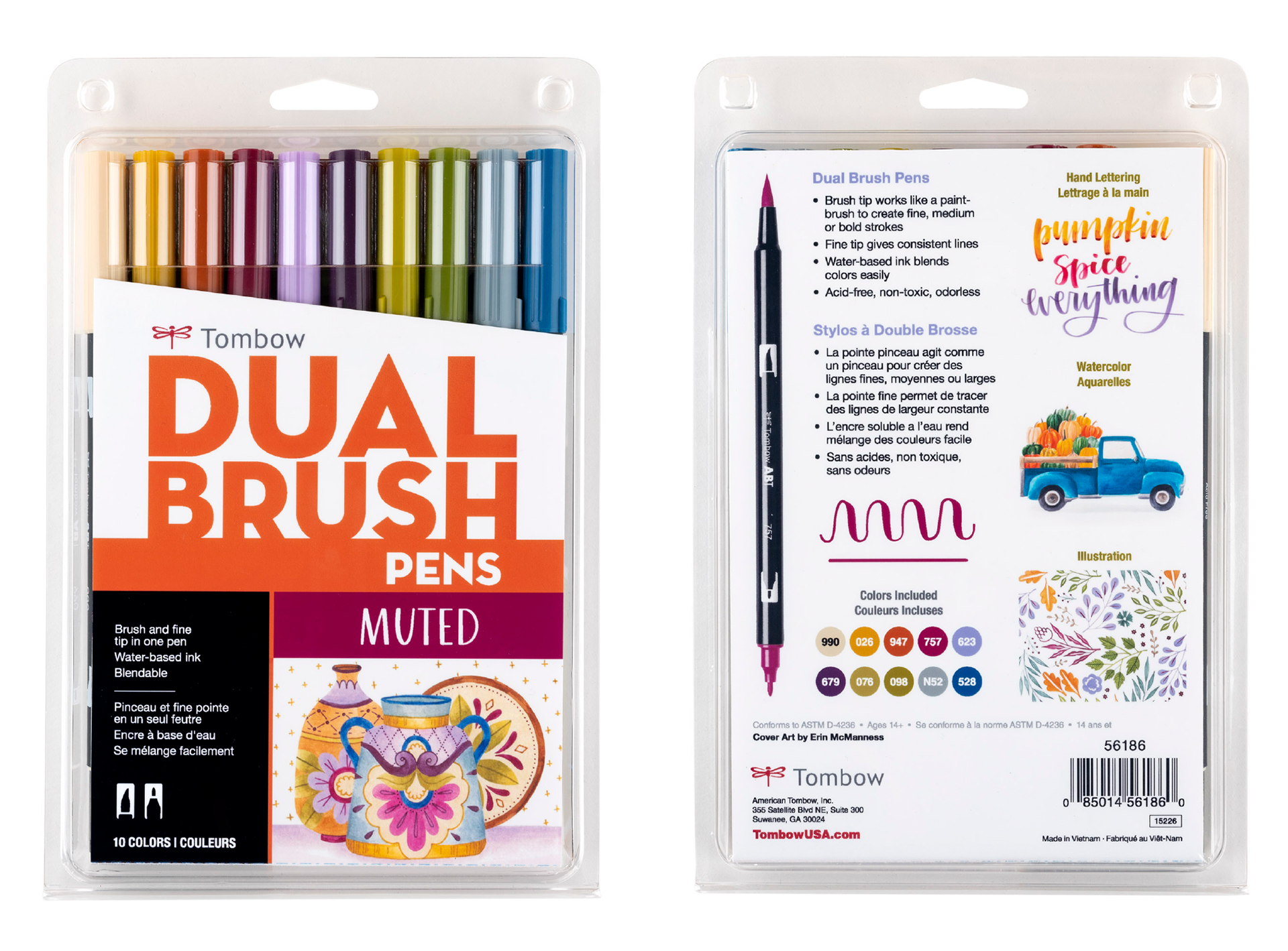
Muted Palette
Art Direction
The goal of the Muted set artwork is portray a message of authenticity by focusing on handmade goods and Mexican-style pottery. We were drawn to the Mexican-style pottery because of the unique shapes and sizes, along with the painted patterns and motifs.

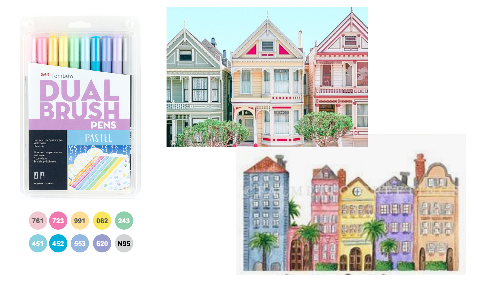
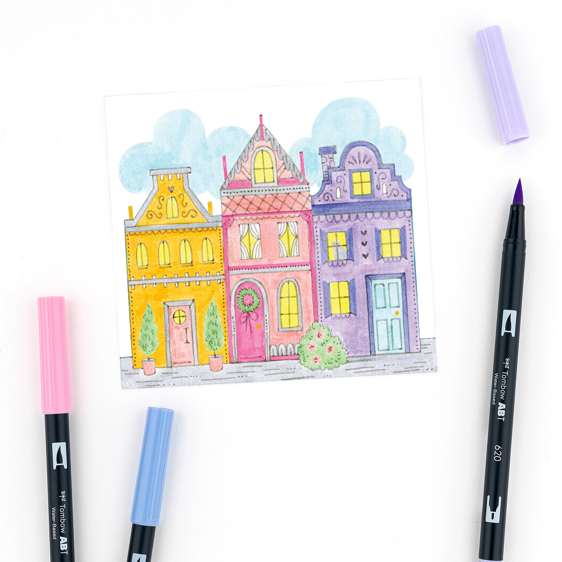
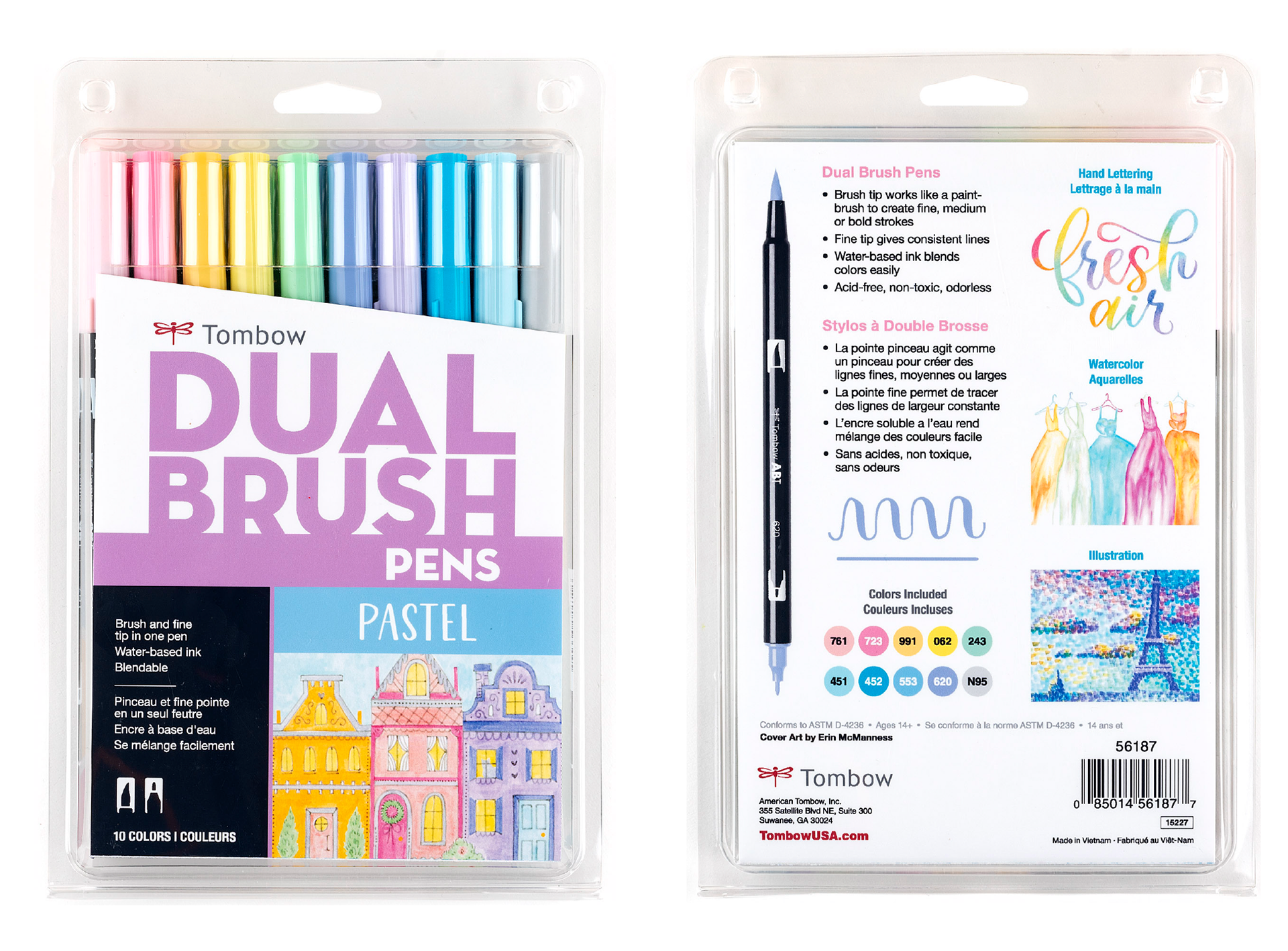
Pastel Palette
Art Direction
The goal of the Pastel set artwork is to portray the message of finding beauty in history and establishing your own unique identity. We wanted the artwork to be reminiscent of the colorful houses found in Charleston's Rainbow Row and San Francisco's Painted Ladies. We requested that the illustration be unique and not a replica of either place, but rather have a playful spin and style of it's own.
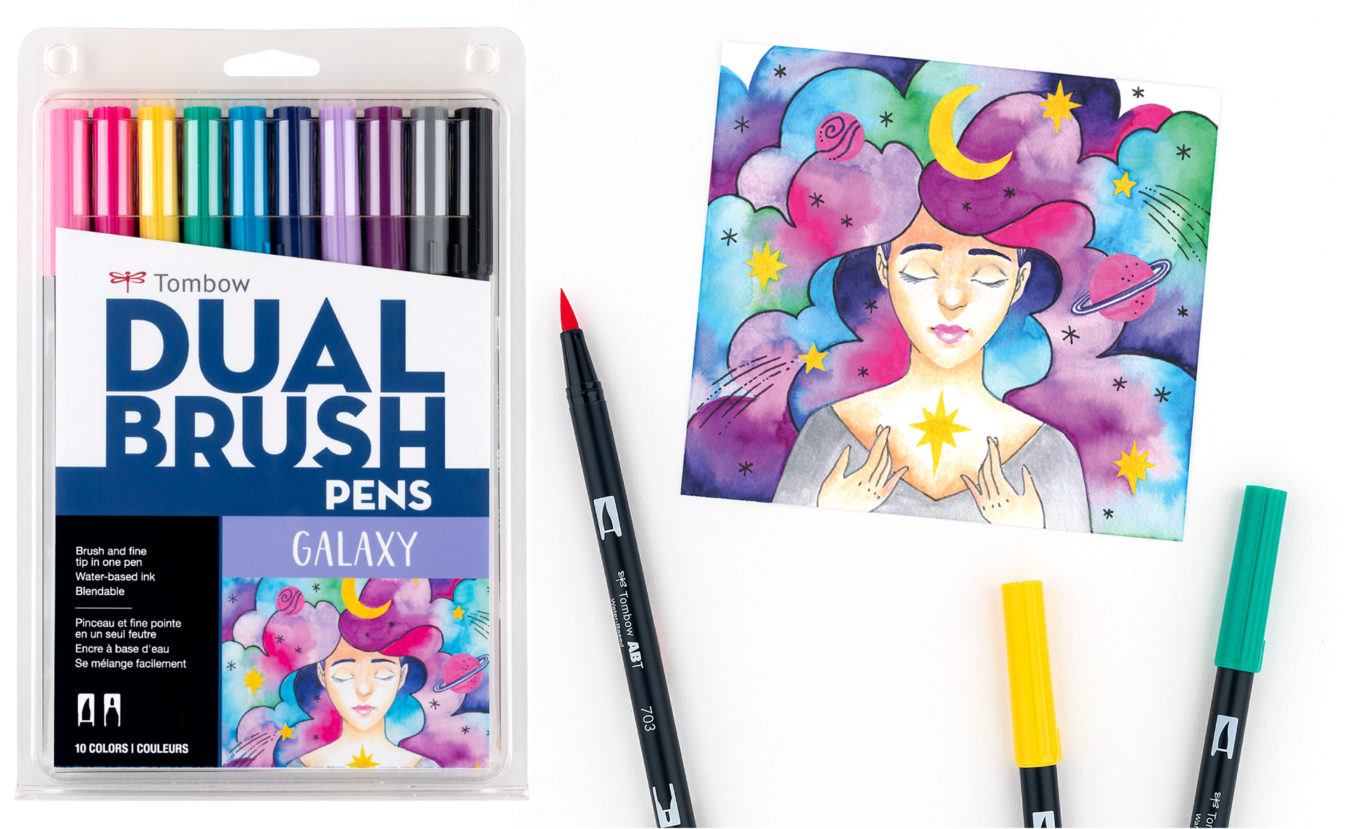
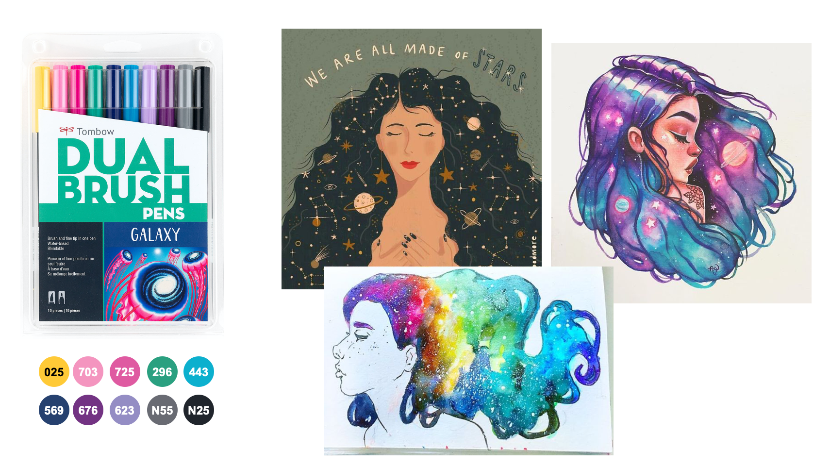
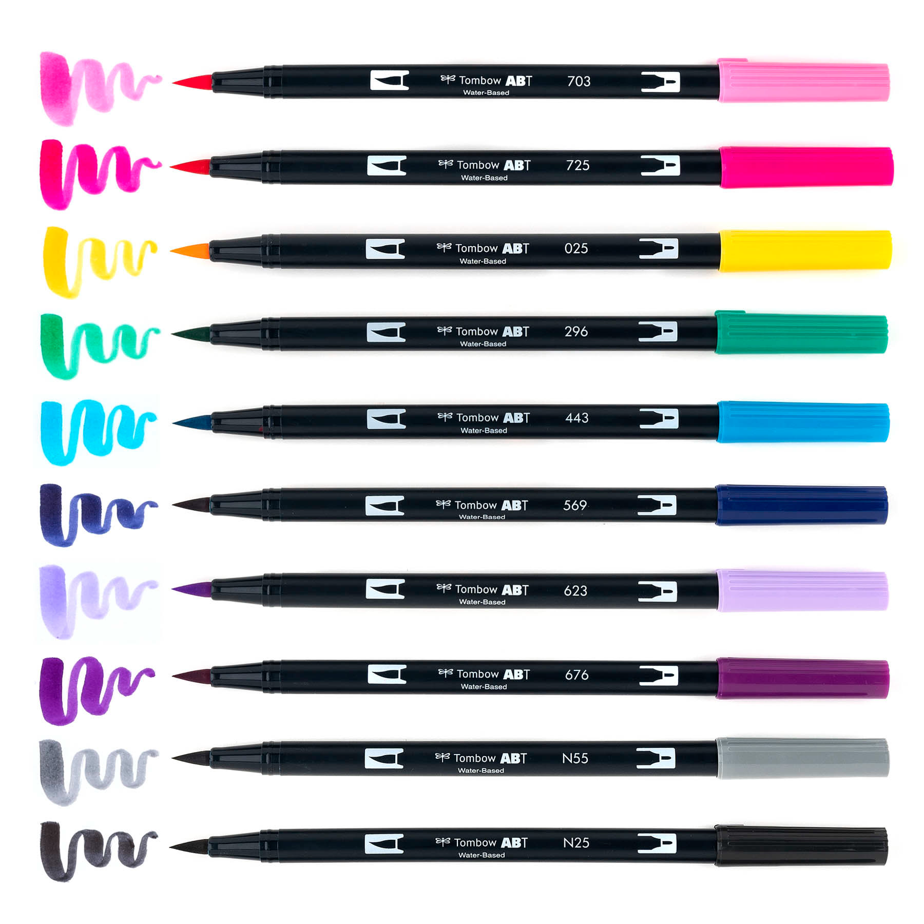
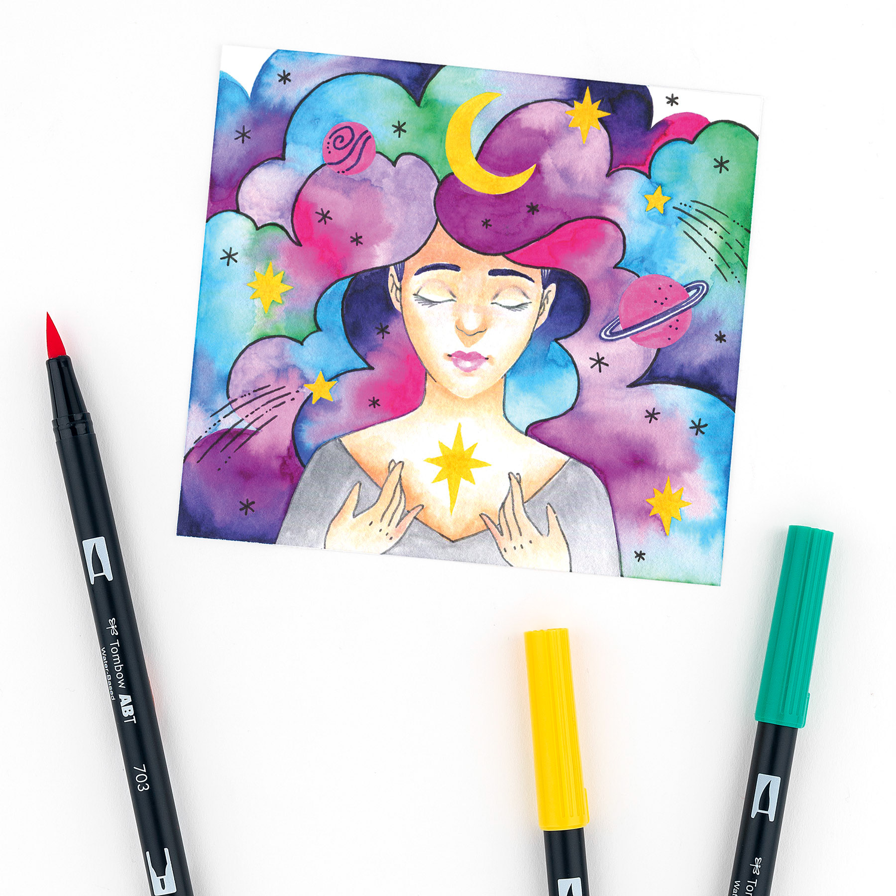
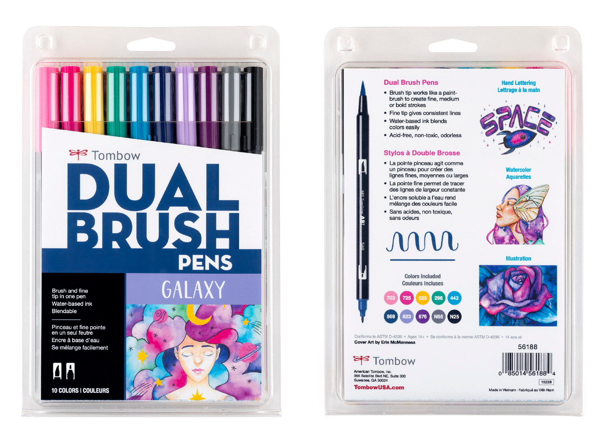
Galaxy Palette
Art Direction
The goal of the Galaxy set artwork is to illustrate inner connectedness and universal love. We wanted to portray this message in an unexpected way by combining planets, constellation symbols, and celestial watercolor blends into a silhouette.
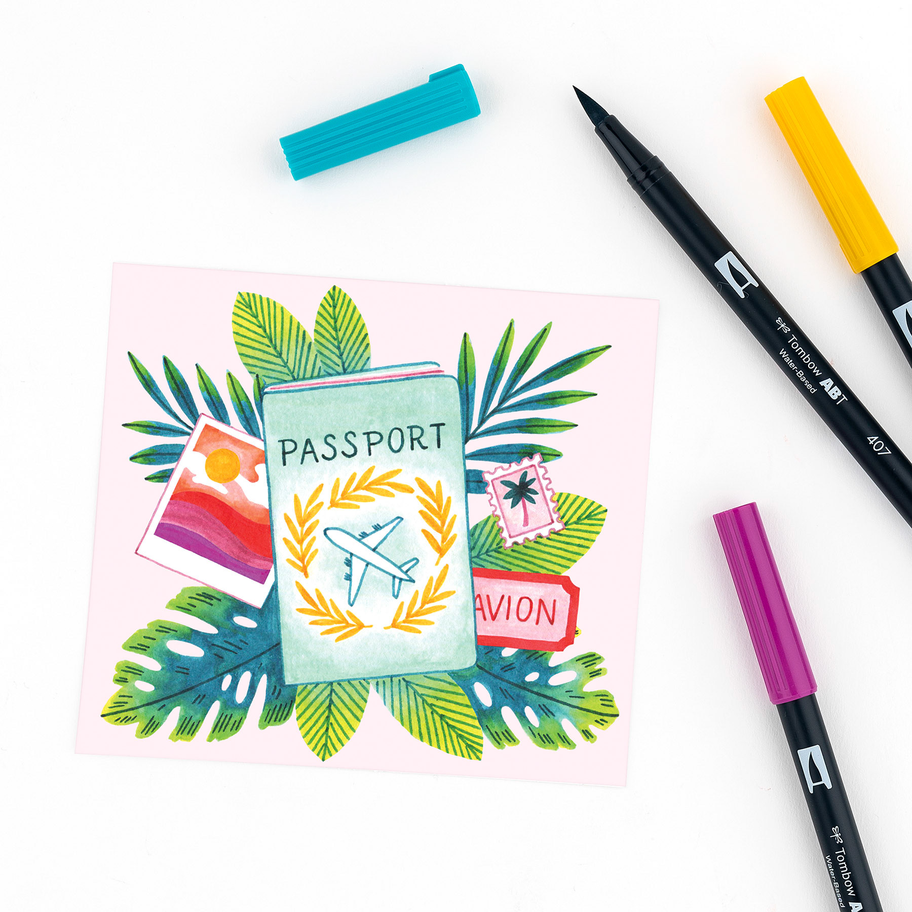
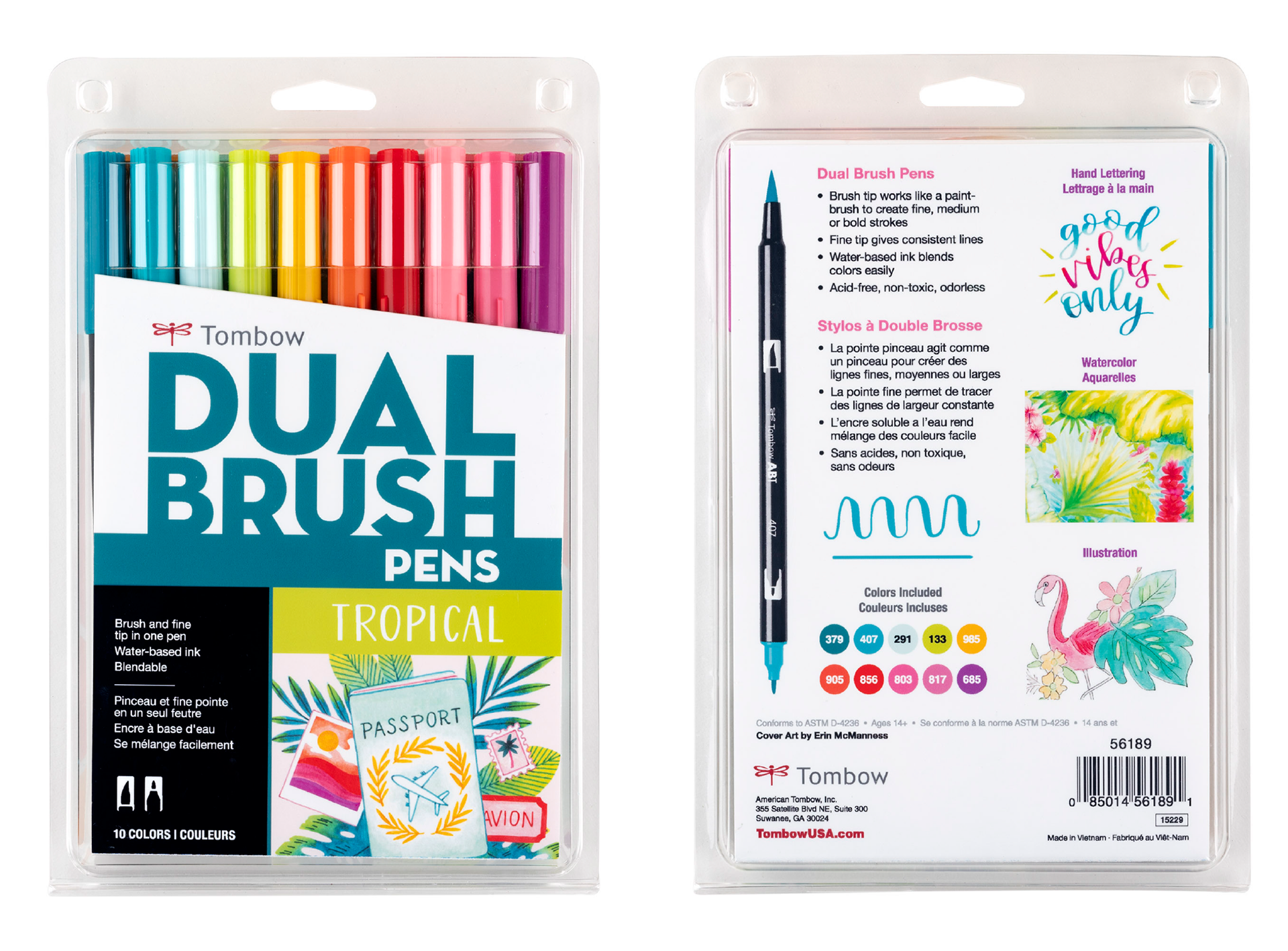
Tropical Palette
Art Direction
The goal of the Tropical set artwork is to portray a message of free spirited exploration and travel. We wanted this artwork to give the impression of a tropical vacation and include symbolism of travel such as luggage, passport, stickers/stamps, camera, fedora, palm leaves, etc.

Final Artwork
Illustrations were created by Erin McManness of Paper Raven Co.
Final Packaging
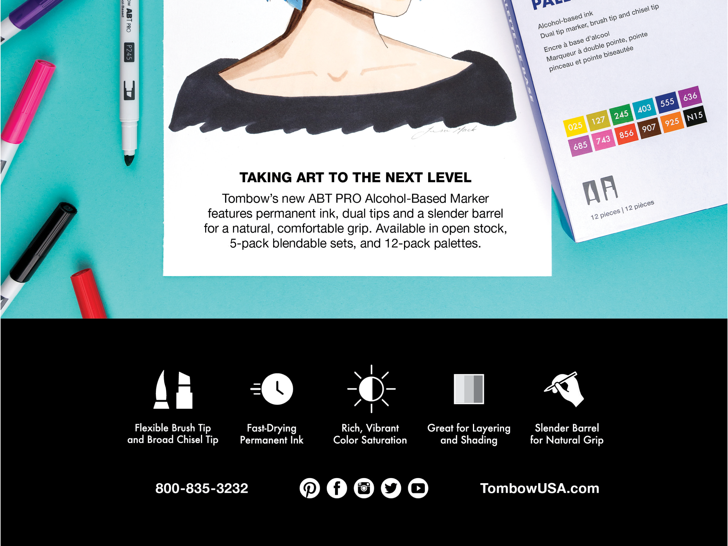
If you'd like to learn more about the Dual Brush Pen product line redesign, you can learn more here.