Social Media Case Study
When starting as the in-house graphic designer for Tombow in 2017, one of my main objectives was to redesign social media graphics to better align with Tombow's audience of artists, crafters and hobbyists, as well as attract new followers by creating a visual language they can relate to.
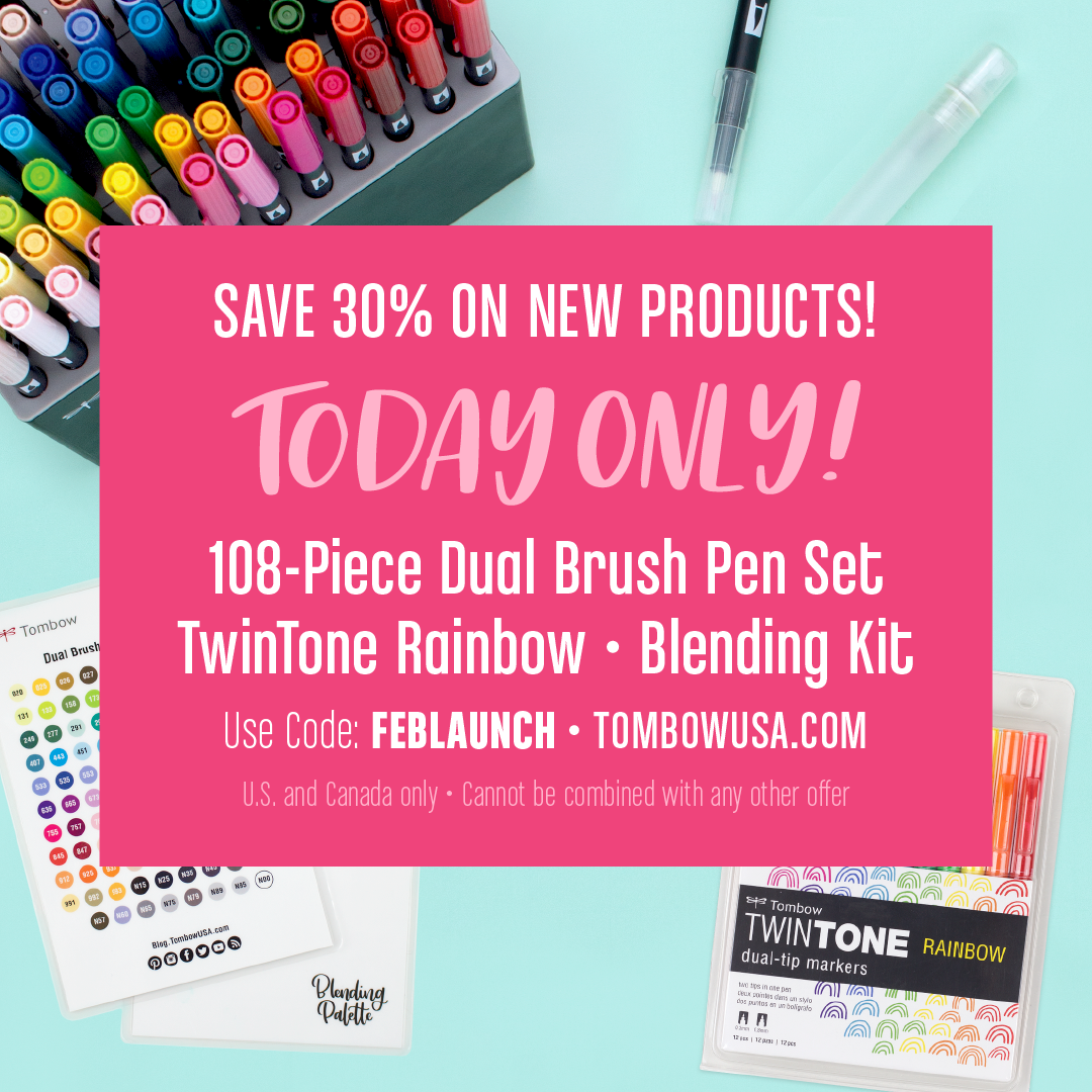
The images below represent a handful of the graphics I pulled together to better understand how fans and followers were currently viewing the brand. From the existing graphics, I made a quick list of design consistencies and reoccurring themes that stood out to me. Next, I categorized these patterns as pros and cons so that I could determine how to move forward in improving the design without reinventing the wheel.
Pros of Original Design:
• Great use of bright colors which are consistently used (for the most part).
• Hand lettered art adds a personalized touch – it's very fitting for a marker company who creates and promotes calligraphy products.
• Lifestyle photos help show how products can be used – this helps to give users an idea of how they could use the products themselves.
• The illustrated pencil stands out and seems fitting for the brand since artists draw and would be attracted to hand-drawn images.
• The confetti is fun and playful and relatable to the audience.
Cons of Original Design:
• Designs incorporate a lot of geometric shapes that give the brand a dated look.
• The product launch graphics lack typographical hierarchy and the angled color blocks create odd shapes and trapped whitespace.
• Outlined and shadow text creates clutter within the designs. Text would be more readable without it.
Key Takeaways & Objectives:
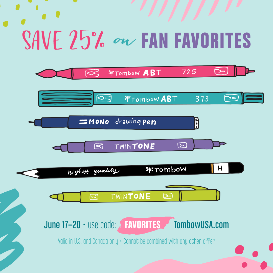
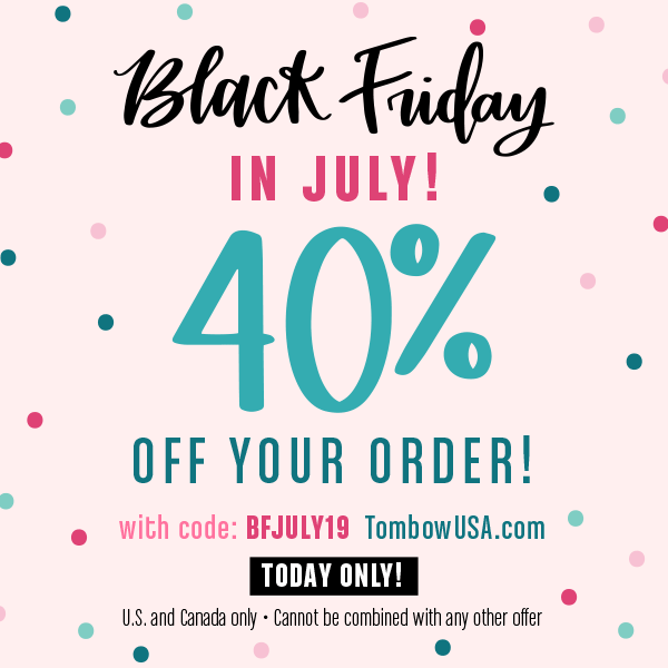
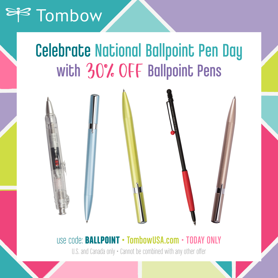
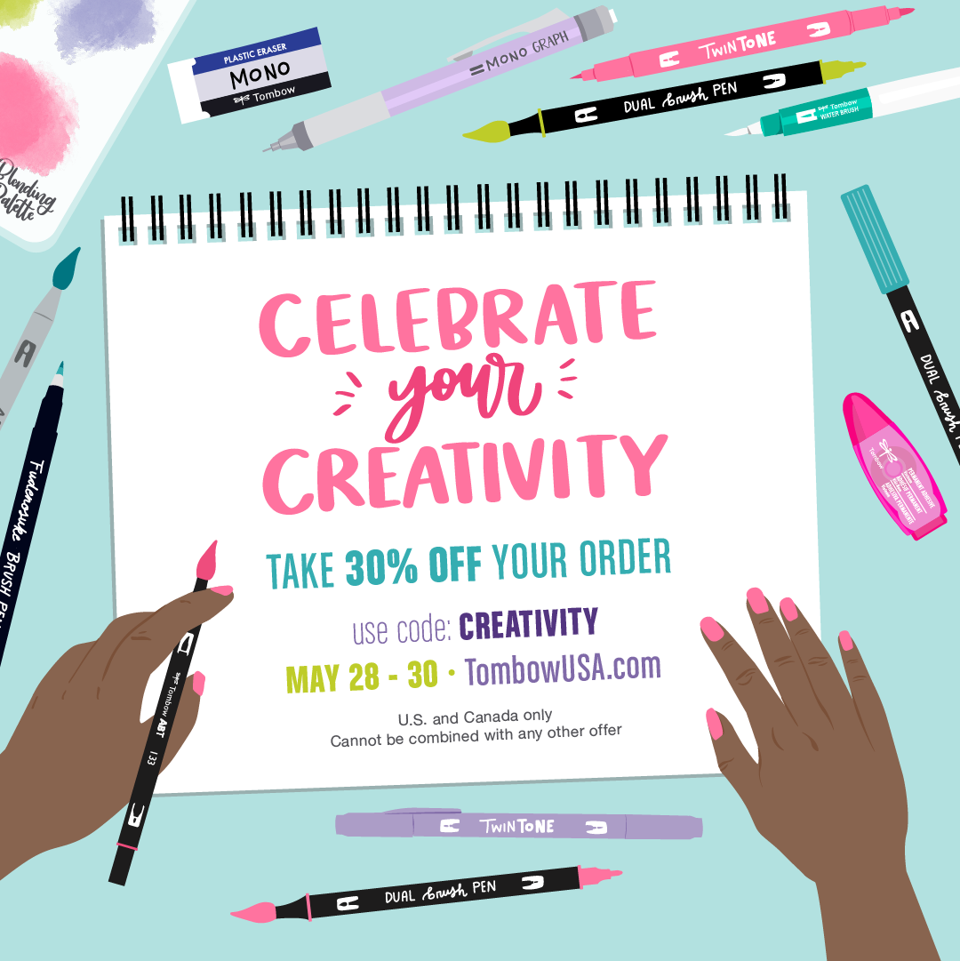
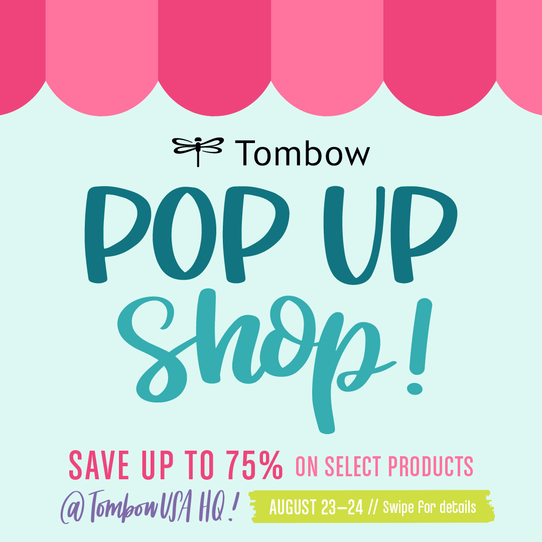
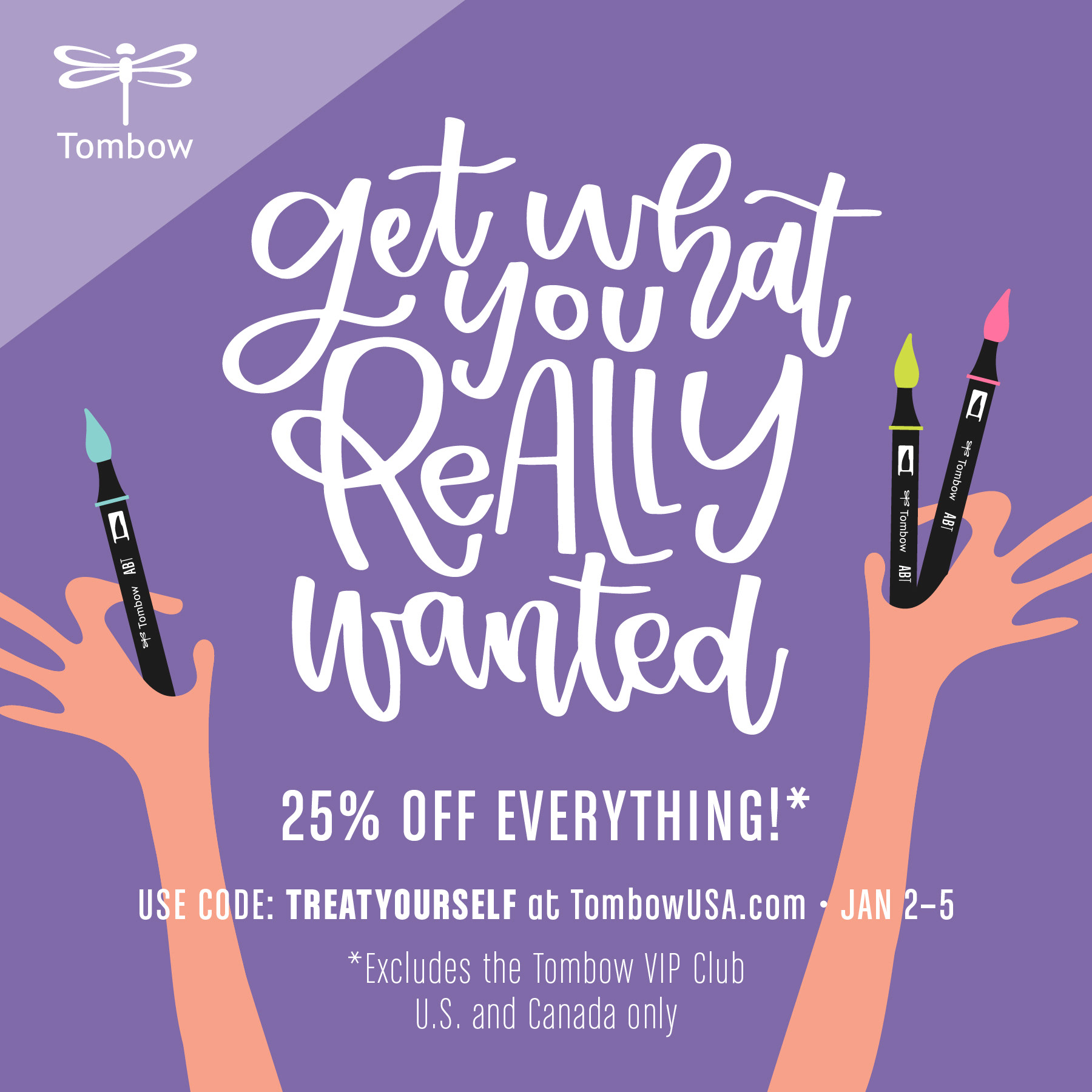
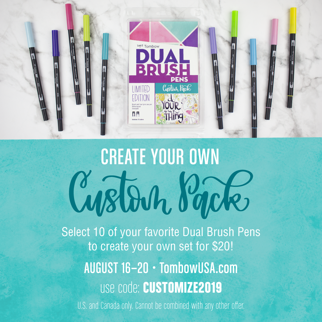
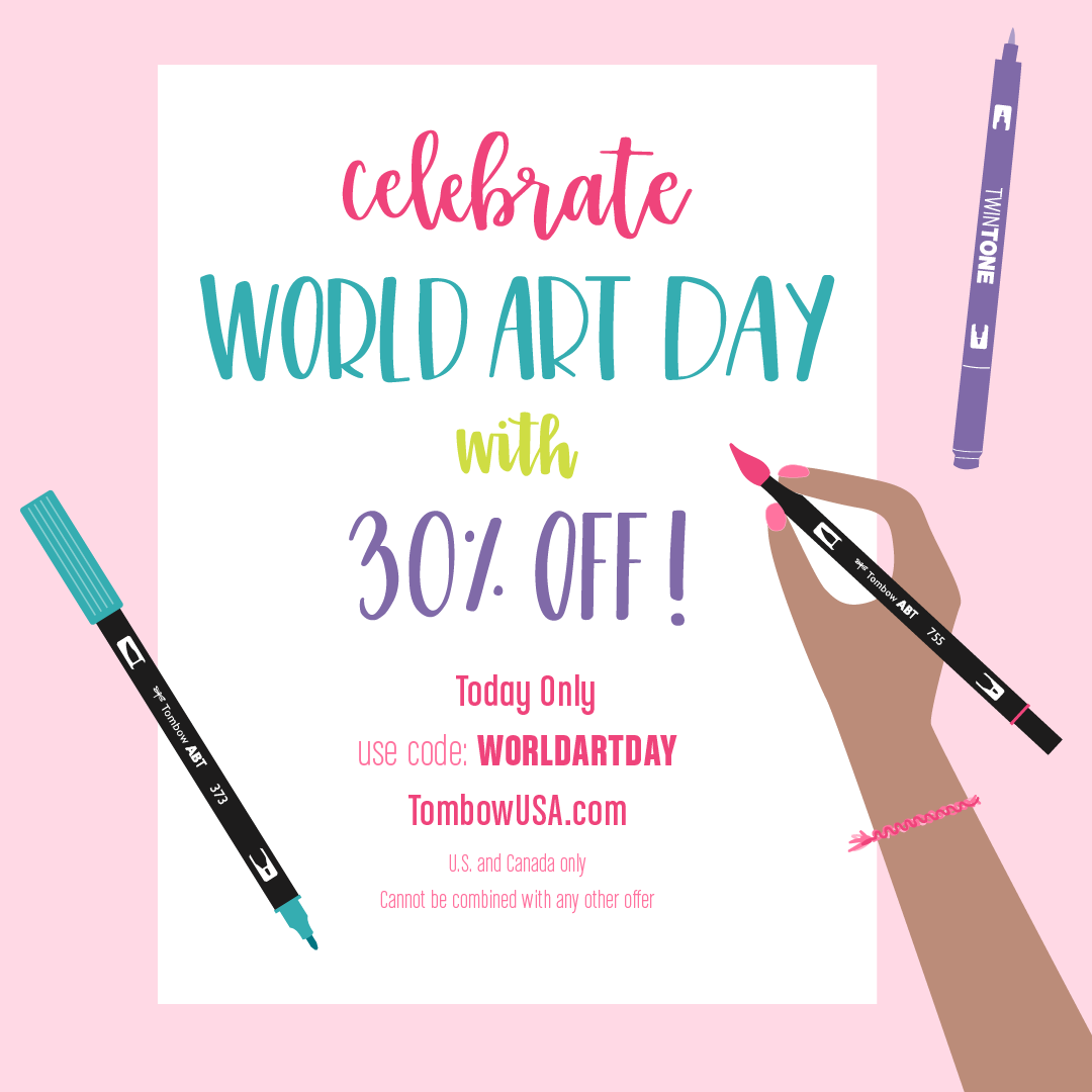
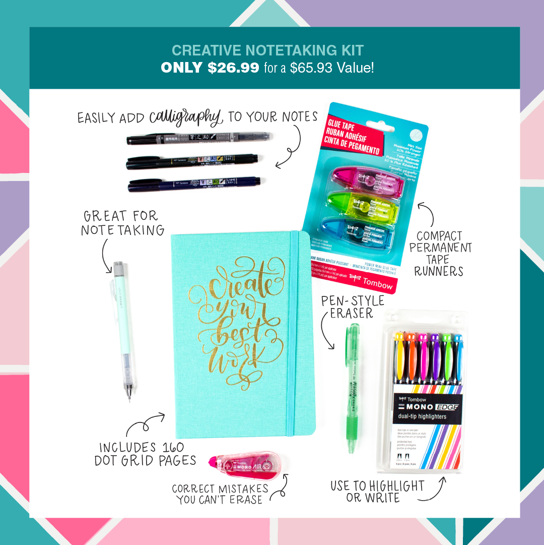
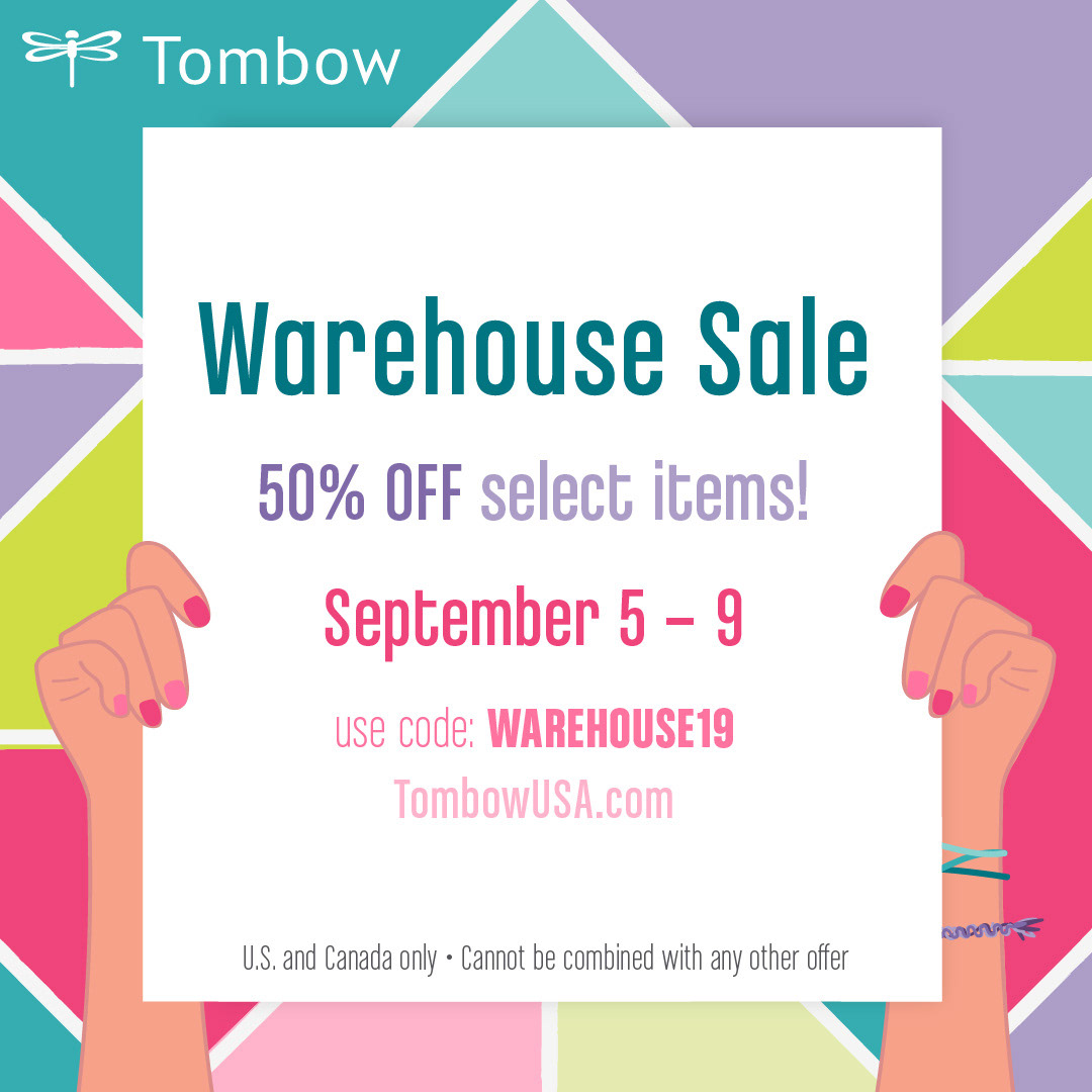
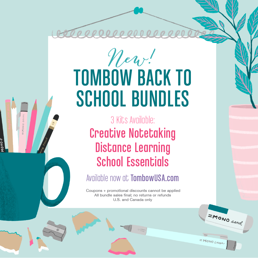
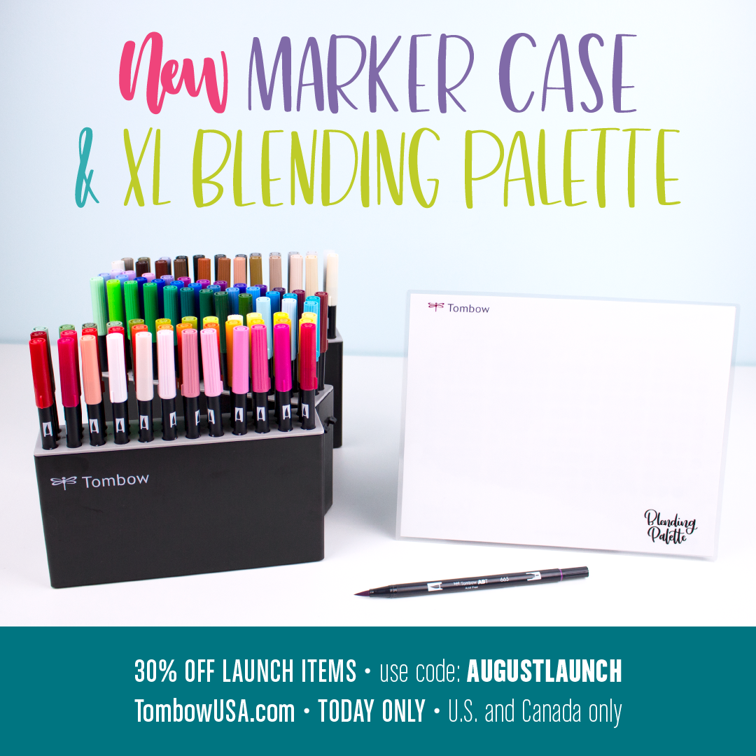
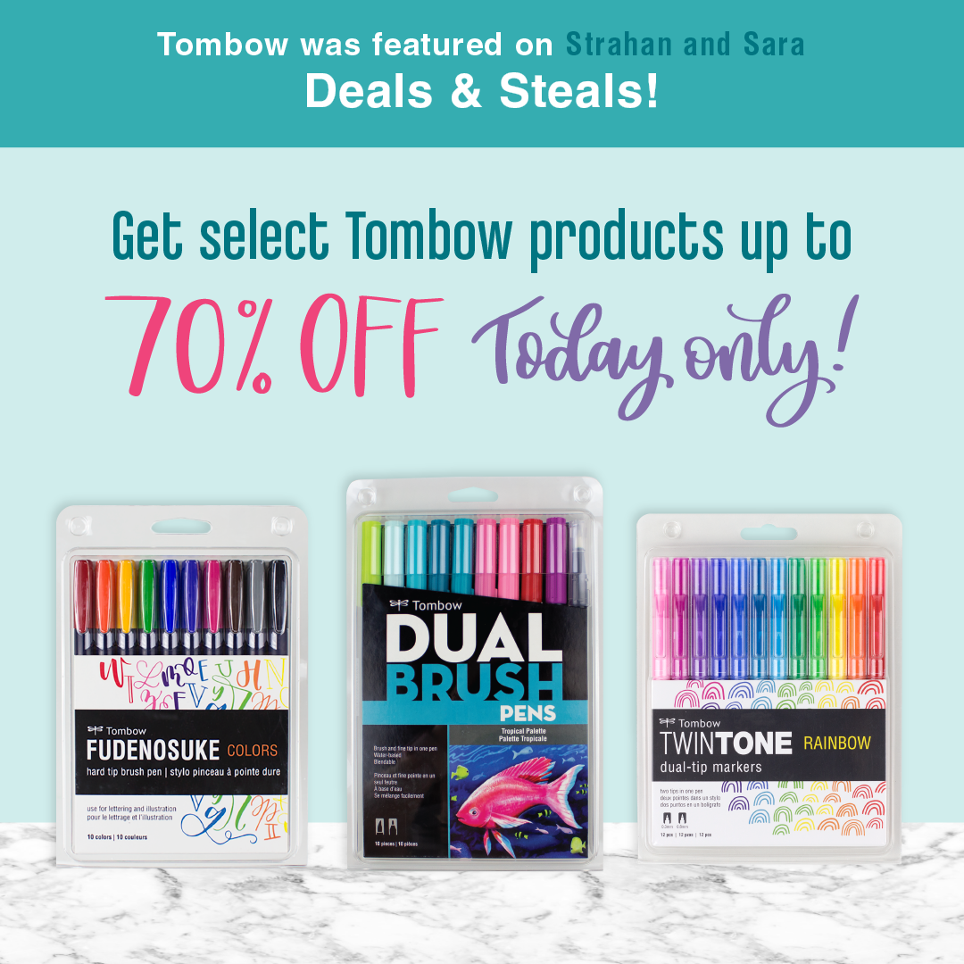
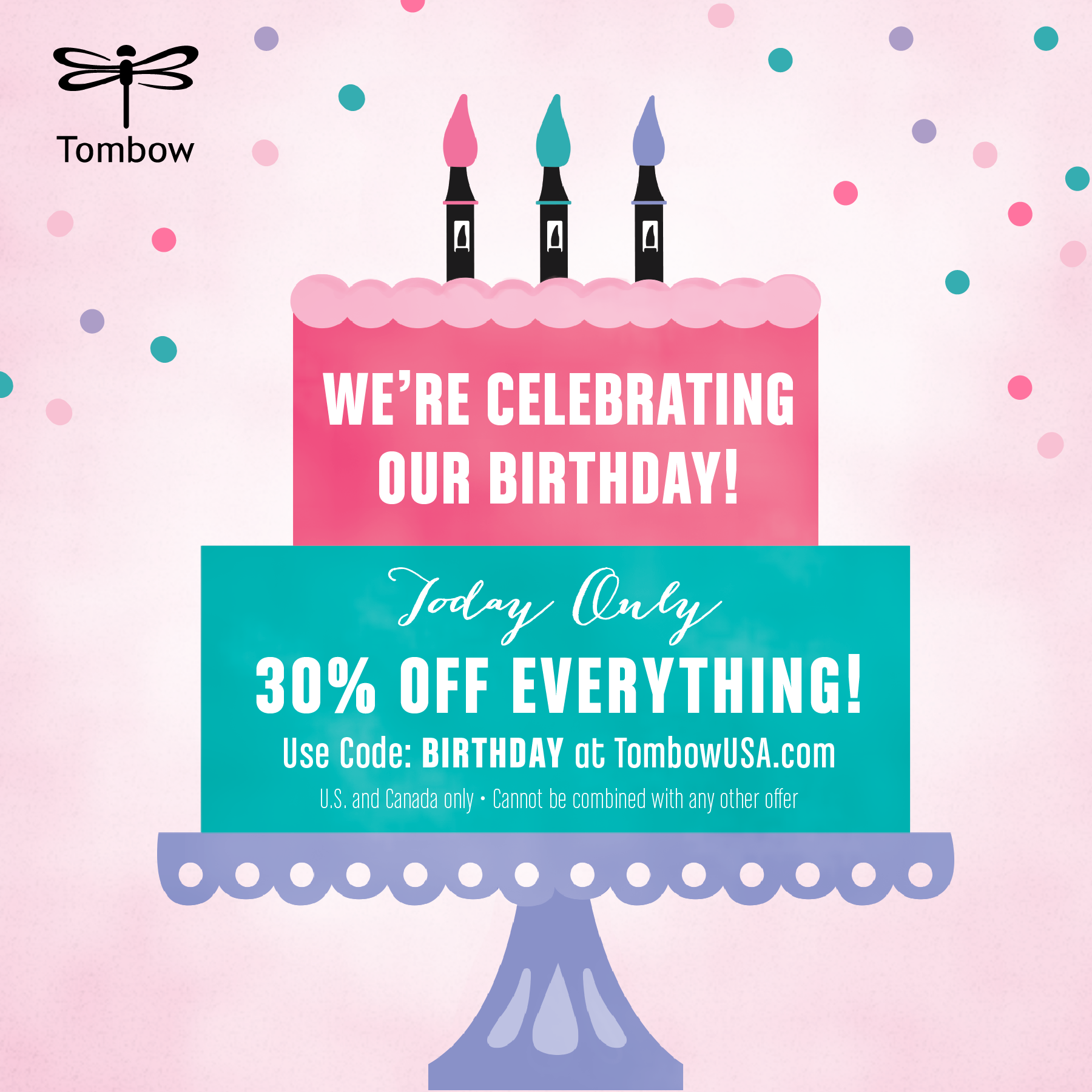
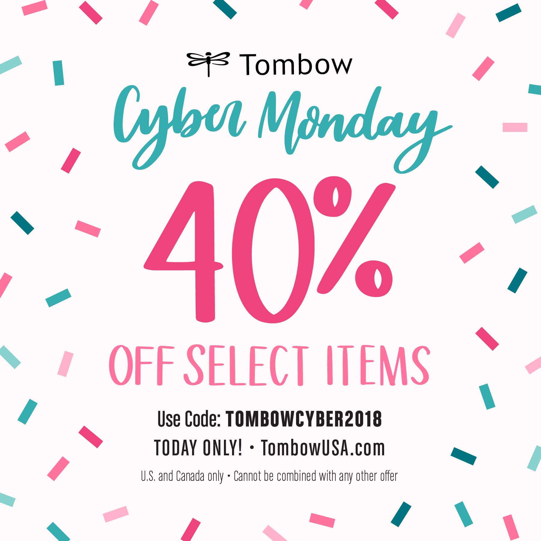
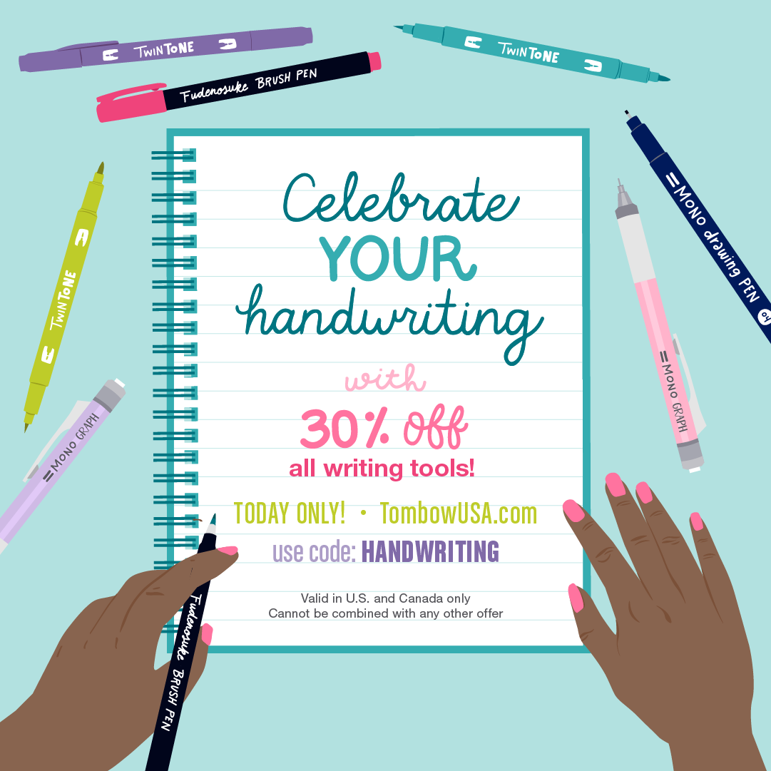
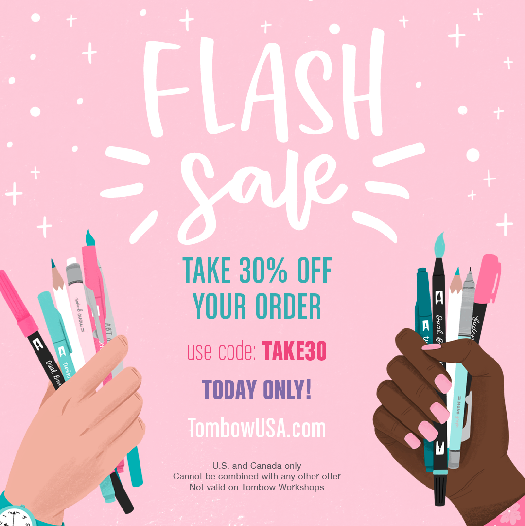
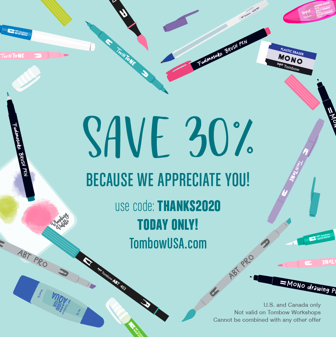
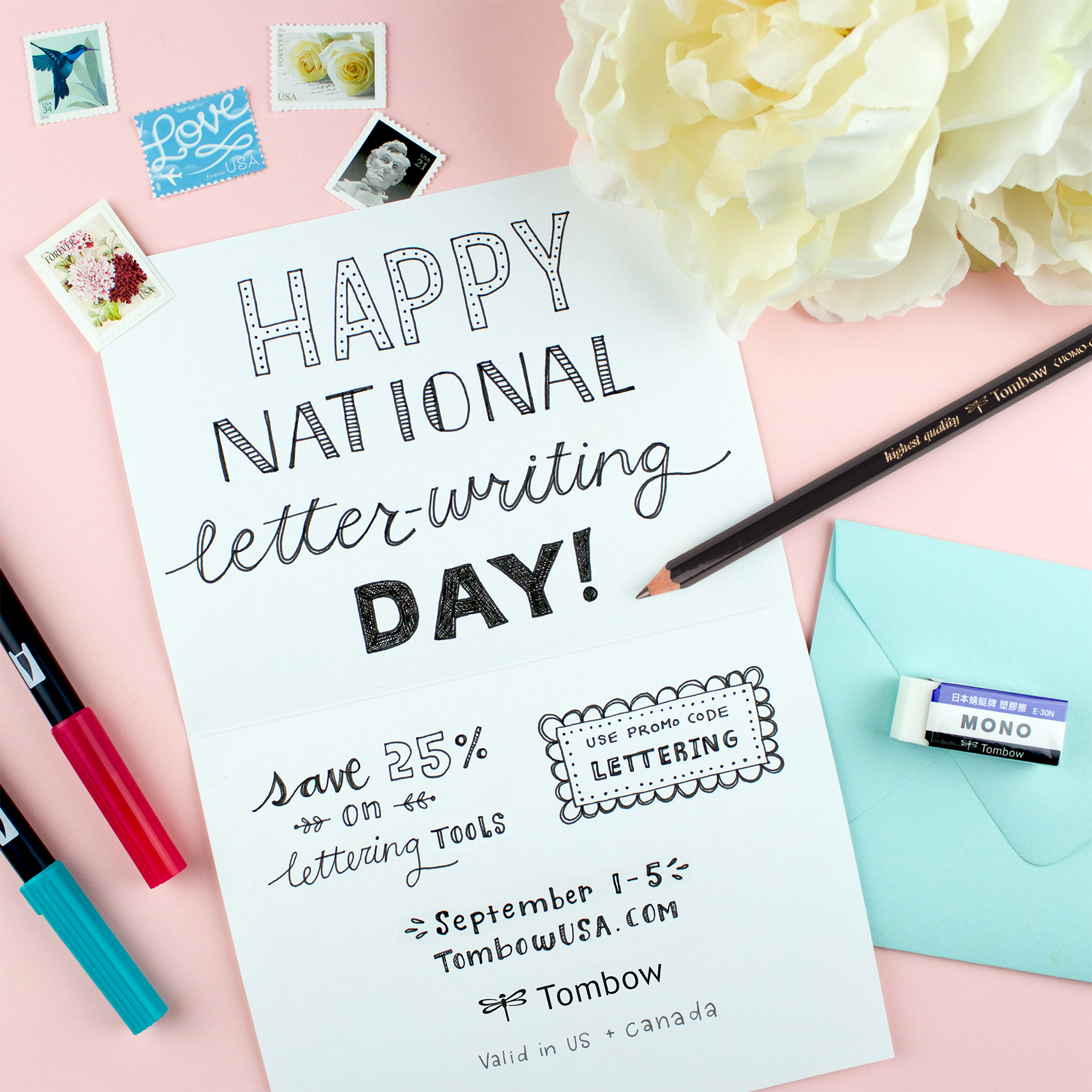
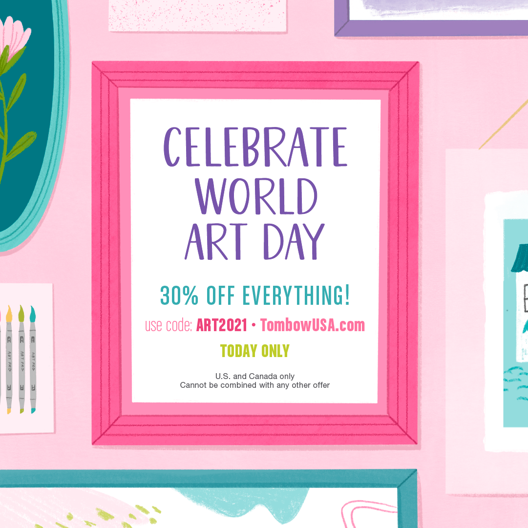
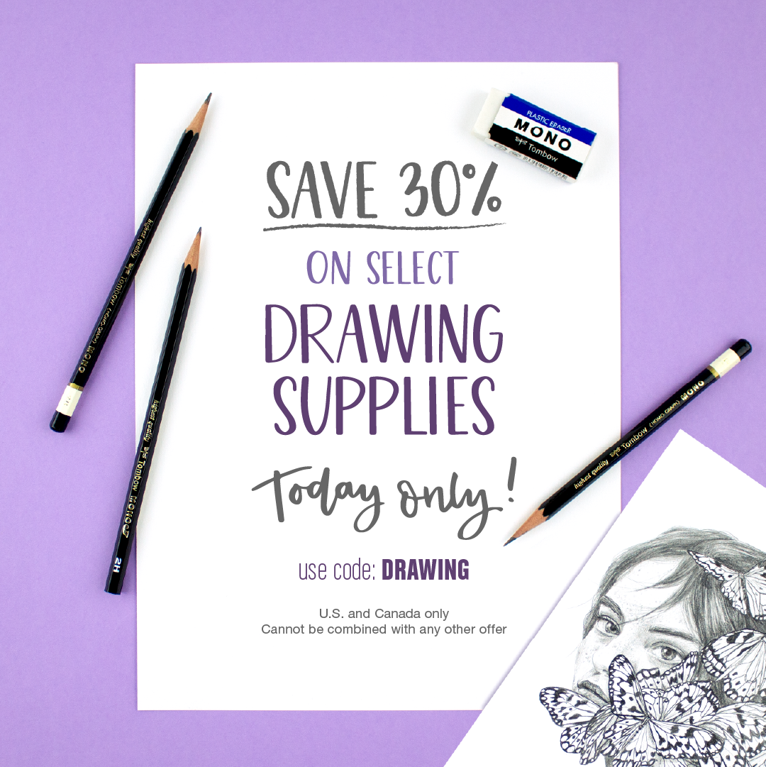
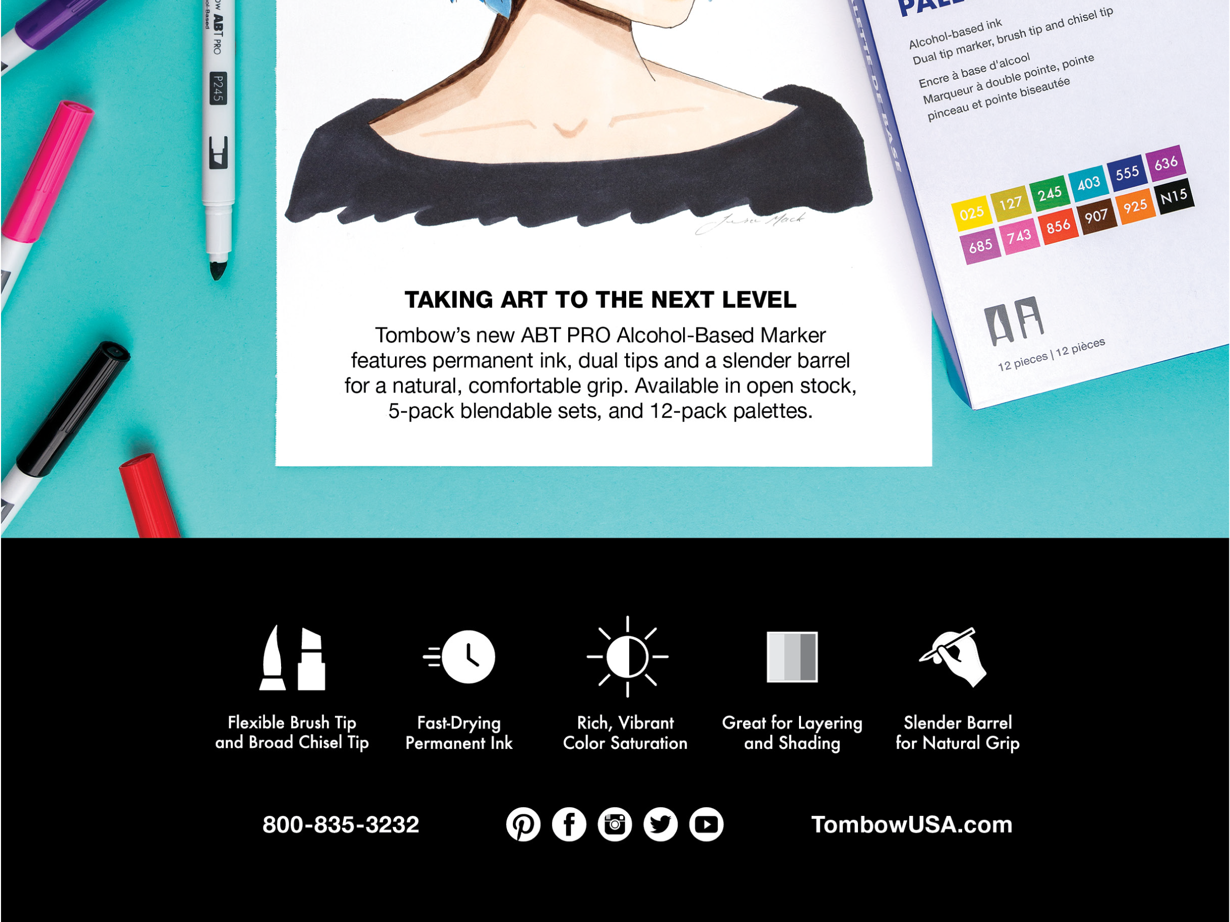
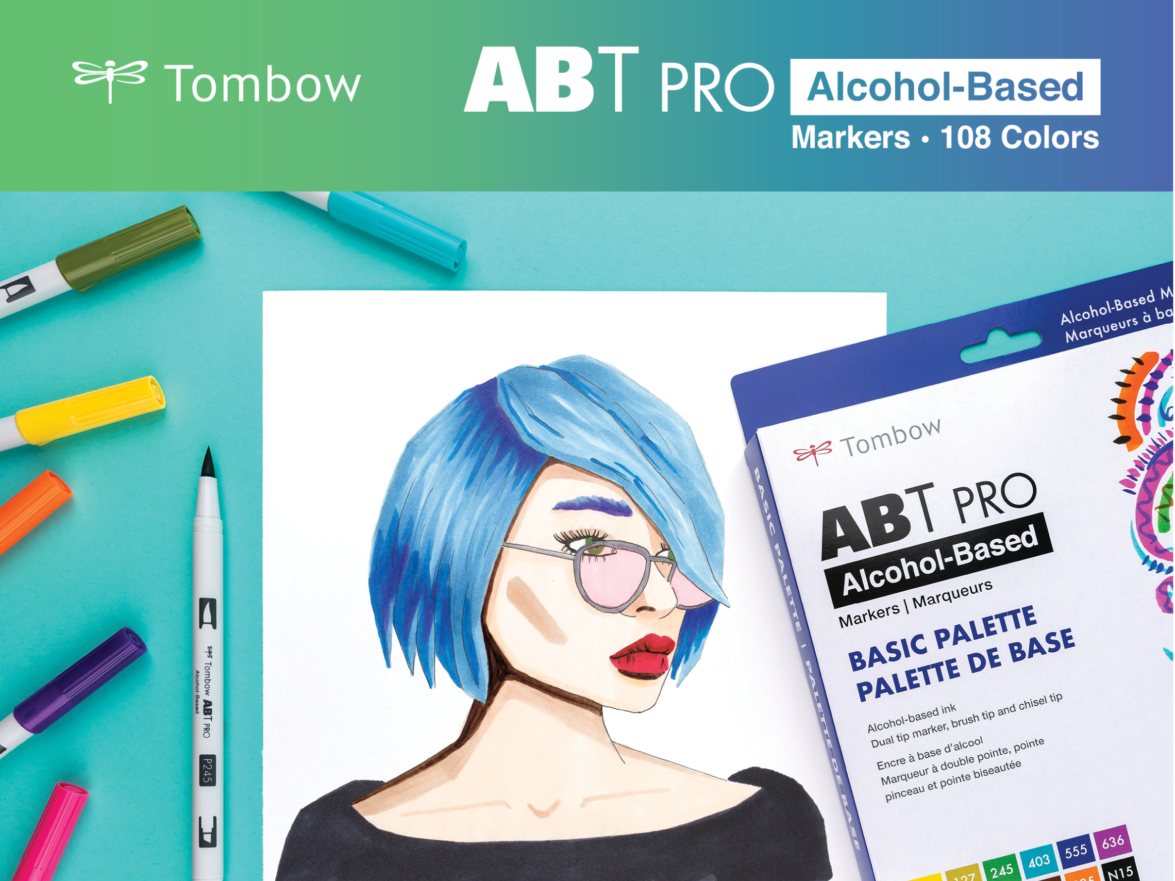
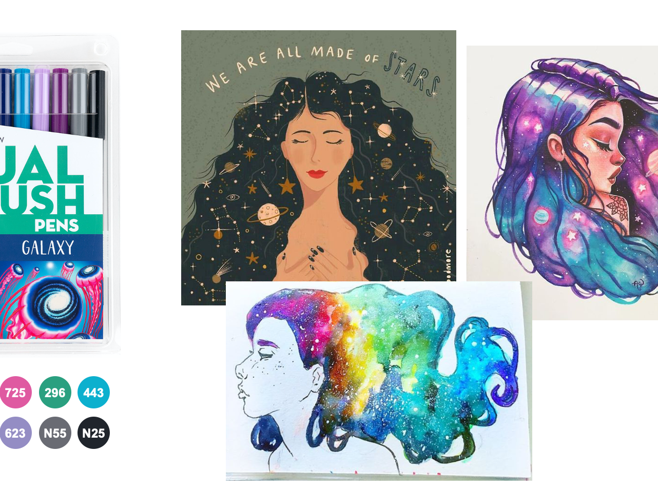
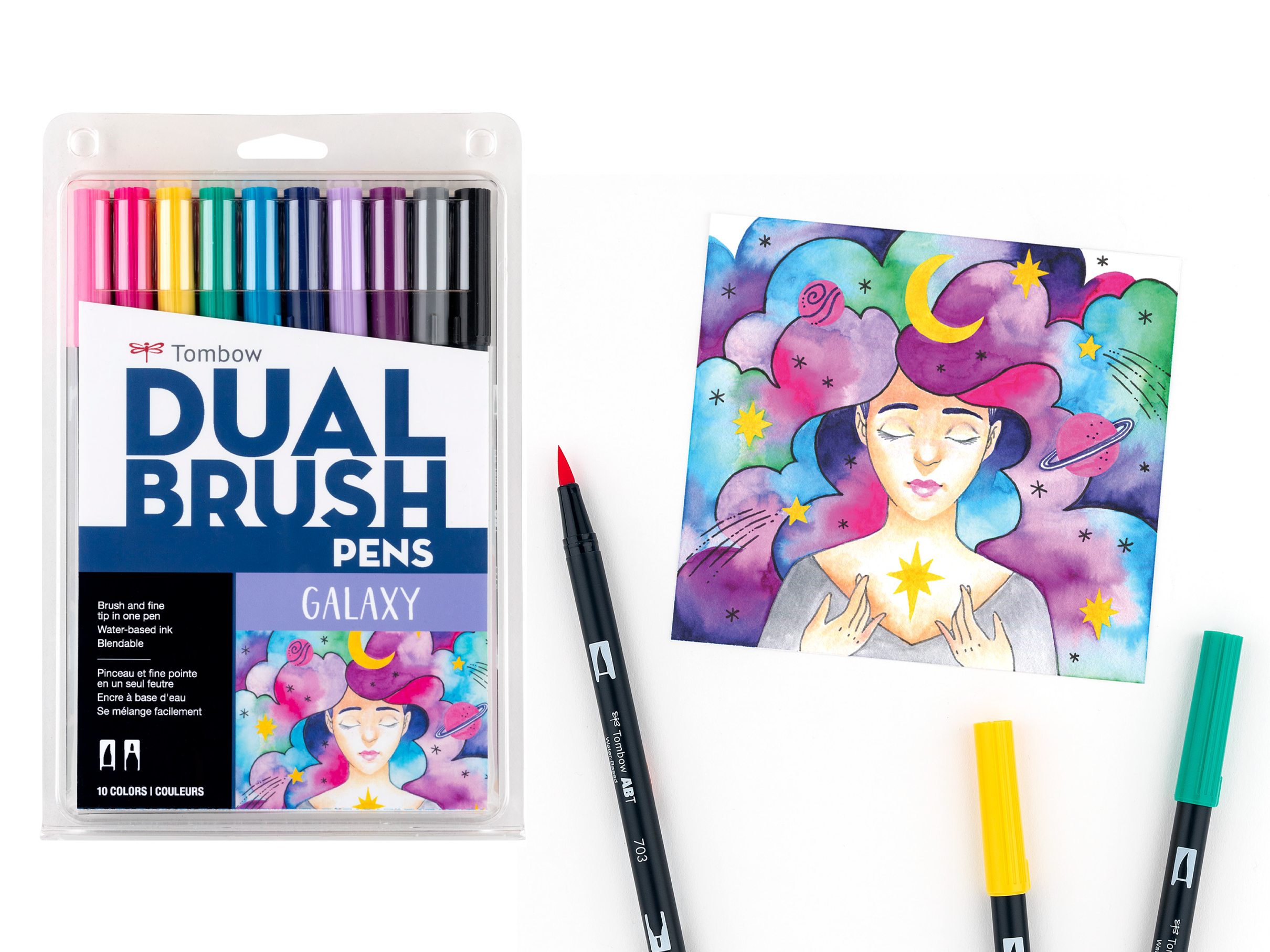
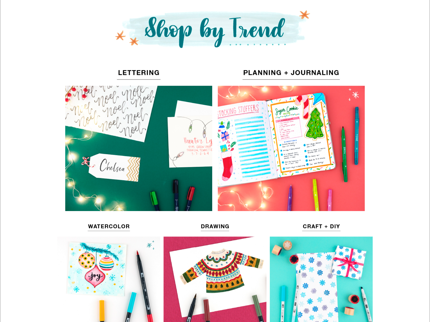
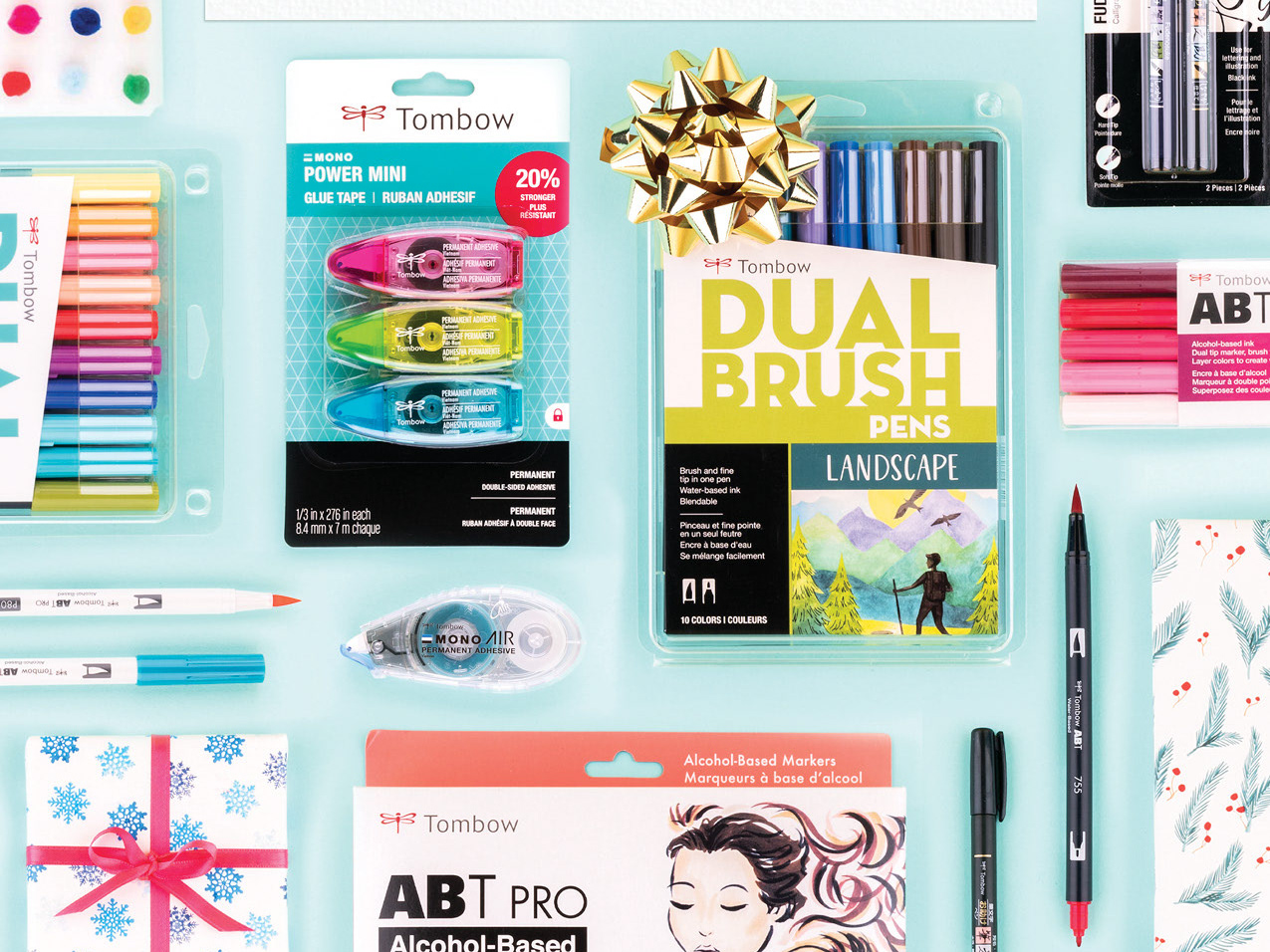
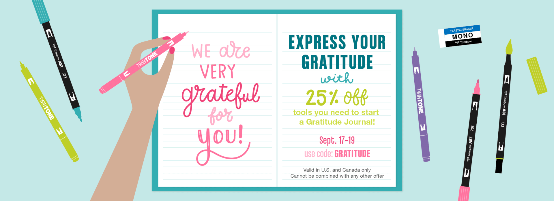
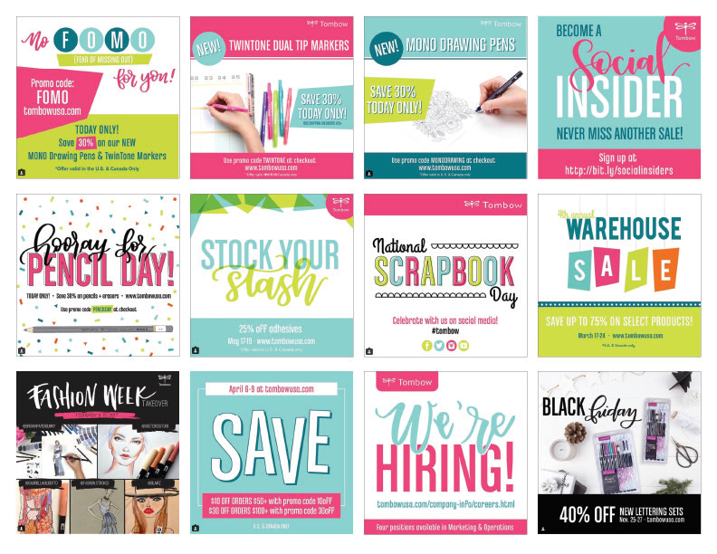
After reviewing the current designs, I created a list of key objectives based on the pros and cons lists to help establish a refreshed look for the brand. The graphics below are examples of some of the product launch and promotional graphics that are now standard to the brand.
Goal 1: Soften the color palette by incorporating multiple shades of each color. Remove orange and replace with purple (this was a decision made by the marketing team).
Goal 2: Create custom illustrations of Tombow's most recognizable products and incorporate into promotional graphics.
Goal 3: Illustrate desk scenes with a hand using Tombow products to write the main message on paper, incorporating calligraphy and hand lettering. This is an added layer of detail and personalization which is something artists and crafters care about.
Goal 4: Take in-house lifestyle photos for product launches and promotions rather then using stock photos so that images are personalized to the brand.
Goal 5: Incorporate expressive details that relate to products customers use when crafting; such as watercolor swashes, detailed line drawings, patterns, textures, scanned papers, washi tape, scribbles, etc.
New Tombow Social Media Graphics